

Breathing fire
Breathing fire
Unimark International's 1971 logo and corporate identity for AGIP

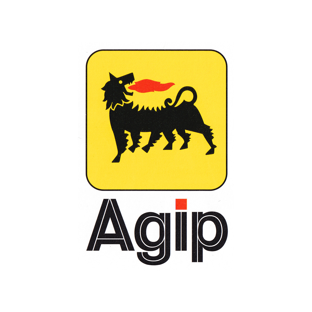
Towards the end of the 1960s Italian oil company Azienda Generale Italiana Petroli (AGIP) had secured the largest market share in the country and its filling stations were considered to be the best equipped and offering the widest range of services.
Buoyed by this success, AGIP embarked on the development of a new corporate identity. This intended to better reflect the quality of its service, help with its expansion into products beyond fuel, present itself as a major Italian business with a ‘strong social and cultural sensibility’ and support its mission to ‘provide a wide range of services’.
The Milan office of Unimark International, headed by Dutch-born designer Bob Noorda, was commissioned to review and develop a new image for the corporation. This would be vast in scope, encompassing design for service stations, fuel pumps, packaging, signage, stationery, uniforms and the interiors of motel restaurants.
Continuing reading to see how the AGIP logo was adapted for the 1970s, and understand why a introducing a corporate typeface made sense.
