Not Found
Not Found
Not Found
Not Found
Not Found
Not Found
Not Found
Not Found
Not Found
Not Found
Not Found
Not Found
Not Found
Not Found
Not Found
Not Found
Not Found
Not Found
Not Found
Not Found

Submitted

Profile Card Using CSS Grid & Flexbox

Corvida Ravenβ€’ 570

@SheGeeks

Desktop design screenshot for the Profile card component coding challenge

This is a solution for...

  • HTML
  • CSS
1newbie
View challenge

Design comparison


SolutionDesign

Solution retrospective


Question for Community: Do the challenge design's location and statistics labels (not the numbers) seem bolder than the 400 font-weight listed in the style guide? I feel like that value actually only applied to the age.

Feedback Request: I would love your feedback on the following areas of my code:

  • πŸ“ positioning the background elements
  • πŸ“¦ use of margins/padding to control spacing within the layout

I tried to get as close as possible to the actual design based on the design file dimensions (desktop: 1440 x 667, mobile: 375 x 667), which created a need for more control through margins/padding. If there are smarter or cleaner ways to accomplish this, please do share!

Community feedback

P
ApplePieGiraffeβ€’ 30,545

@ApplePieGiraffe

Posted

Hello there, Corvida Raven! πŸ‘‹

Congratulations on completing your first Frontend Mentor challenge! πŸŽ‰ Great job on this one! πŸ™Œ Your solution looks just like the design and the background images are well-placed (something that can be a little tricky). πŸ‘

Keep coding (and happy coding, too)! 😁

1

Corvida Ravenβ€’ 570

@SheGeeks

Posted

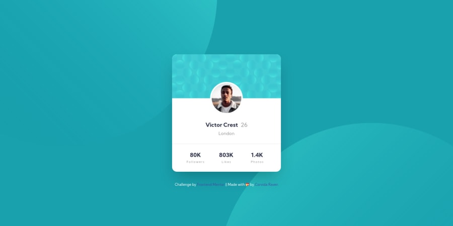
@ApplePieGiraffe Appreciate the warm welcome and encouragement! This challenged look deceptively easy and I initially breezed through it. I saved positioning the background elements for last and I'm glad I did. They made this challenge trickier than one might've expected. Enjoyed the curveball and lessons learned trying to knock it out the park.

1
P
ApplePieGiraffeβ€’ 30,545

@ApplePieGiraffe

Posted

@SheGeeks

No problem! πŸ‘

BTW, in answer to your questionβ€”I've noticed that once in a while, some pieces of text in the design JPGs look a little lighter or heavier than the weights mentioned in the style guide. You could always just import one or two more font weights in order to find the look you think seems best, I guess.

Your code looks pretty goodβ€”you might want to use rem values for properties like margin or padding, though, so that the design itself (and not just the text) will scale a little with the font-size of the document.

And getting things pixel-perfect is pretty nice (IMO) but definitely not necessary, so don't worry about it too much if you don't want to.

Hope that helps. πŸ™‚

1
Raymart Pamplonaβ€’ 16,090

@pikapikamart

Posted

your work there is spot on. On the positioning of background, as far as I can tell, you made it well and seeing your layout, like what I said, spot on^. But a suggestion, the body tag grabs the whole element right, semantic at that way. But what you did, is that you positioned fixed the card, that means, going of of the flow of the body. You could use in the body tag

align-items: center;
display: flex;
justify-content: center;

so that your card is still in flow

Other than that, great work^

1

Corvida Ravenβ€’ 570

@SheGeeks

Posted

@pikamart Really appreciate your feedback. To add some clarity, the fixed position was used on the card to keep it centered from top to bottom and left to right. I will play with your code on the body tag this week, but I feel like I tried that code on the body before and it only centered the card from left to right. Feel free to correct me. It's late where I am and my memory may be off.

0
Raymart Pamplonaβ€’ 16,090

@pikapikamart

Posted

@SheGeeks oh but have you added a height property on the body? So imagine this. Giving the body the whole width and height of the viewport, you got the whole size right. Then applying

align-items: center;
display: flex;
justify-content: center;

that, it will centered the item properly, just make sure that the item is not positioned absolute or fixed, not a position that goes out of flow. Just make it static or relative. Since the justify-content goes along the x-axis and align-items is at the y-axis

1
Corvida Ravenβ€’ 570

@SheGeeks

Posted

@pikamart I gave this code a quick test and it did work for the alignment I was looking for. Setting the viewport height and width was a helpful unit to use as well. The only issue I ran into is a few elements being sized differently. With the way my margins and paddings are setup 😩, I'd have to do some serious revising to get the alignment as close as I currently have it. I may attempt this over the weekend. Until then, I'll keep this code snippet for future projects. Thanks for sharing!

0
Raymart Pamplonaβ€’ 16,090

@pikapikamart

Posted

@SheGeeks your welcome, feel free to ask anything in here^

0
P
ApplePieGiraffeβ€’ 30,545

@ApplePieGiraffe

Posted

@SheGeeks

If you're using flexbox on the <body> to center the content of the page (which, like pikamart, I'd recommend), you might need to add min-height: 100vh to the <body>, too, in order to vertically center the card component (otherwise, the <body> will only be as tall as the card and there won't be any room to center the card in). πŸ˜‰

1

Please log in to post a comment

Log in with GitHub
Discord logo

Join our Discord community

Join thousands of Frontend Mentor community members taking the challenges, sharing resources, helping each other, and chatting about all things front-end!

Join our Discord