How many famous graphic designers can you name? A harder question than it should be, but if you like films, you should at least know one.
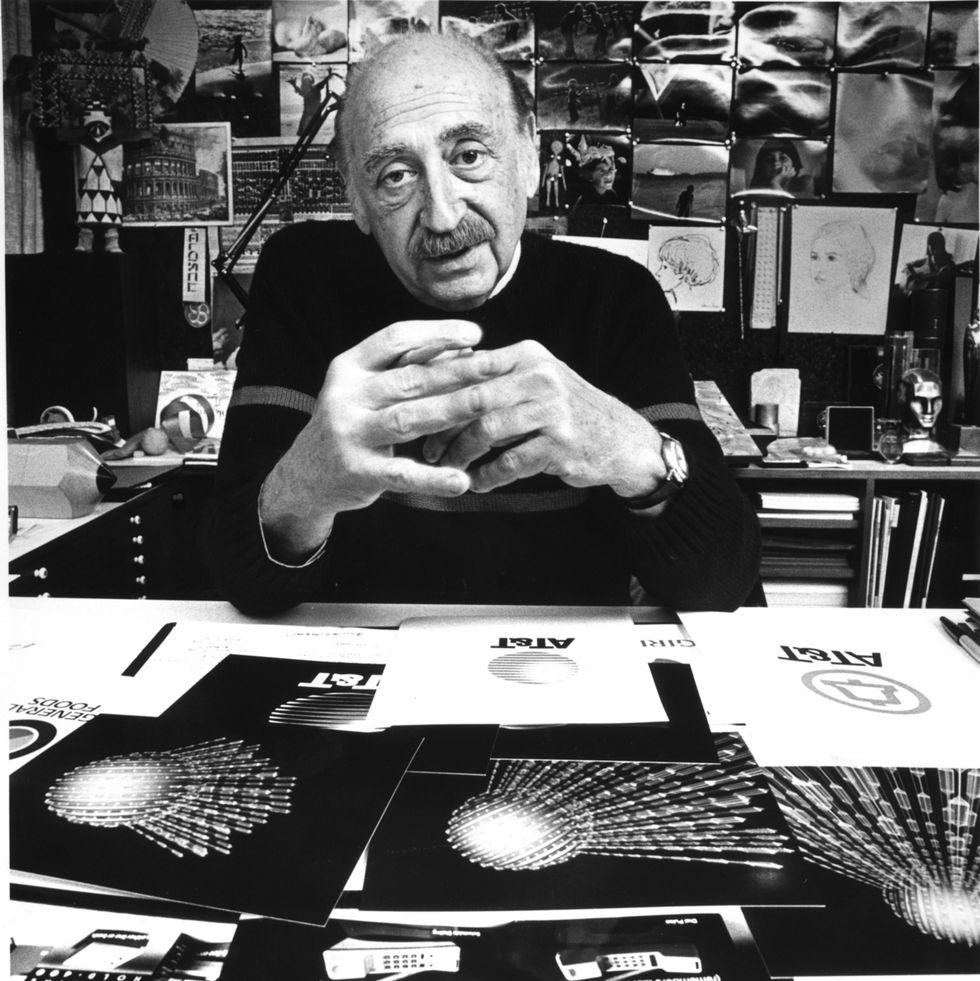
For 50 years until his death in 1997, Saul Bass, born in the Bronx, New York, on 8 May 100 years ago, crafted company logos, advertising campaigns, album covers, product packages, to such prolific and celebrated effect that somewhere along the line, he became known as “the Picasso of commercial artists”. Which at once sounds overblown and doesn’t quite do him justice.
It’s as the reinventor of the film poster and, most significantly, the master — and effectively creator — of the movie title sequence that he is most revered.
You can spot a Bass poster from a mile away, despite the legion of imitators who still try (and fail) to replicate the modernist style he had honed via a childhood obsession with drawing, a transformative period learning from his mentor György Kepes in his twenties (“he really just set me on fire... it would take me hours to settle down after each class”), and later through branding work on Madison Avenue.
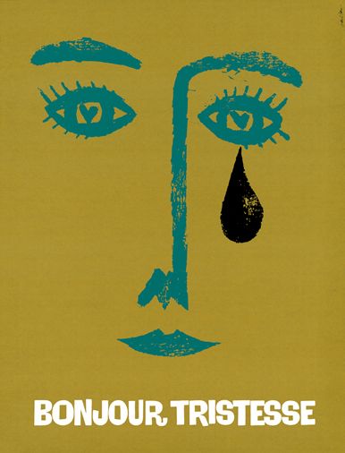
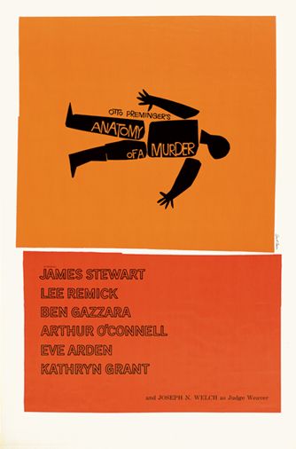
To see the imitations is to understand just how good he was. His use of colour, typography and negative space was daring in the Fifties. Combined with his clear ideas and bold symbols — the fat black teardrop for Bonjour Tristesse, the segmented corpse for Anatomy of a Murder — Bass’s work was to graphic design what Charlie Parker’s was, in the same period, to jazz. It was revolutionary.
That was the posters. His influence on the title sequence was seminal. Before Bass, the title sequence hardly existed; a series of names against a static image while the audience chat- ted.
Often projectionists wouldn’t bother to open the curtains until after the credits had rolled. Bass believed films should begin with the very first frame and that titles were not only a means to transport the audience from the real world to that of the film but an “overture” which set the mood and foreshadowed the story itself: its tone, themes and even ambiguous clues to how the film might be read.
As he honed his craft, working with directors including Billy Wilder, Alfred Hitchcock and Otto Preminger, and later John Frankenheimer, Stanley Kubrick and Martin Scorsese, these sequences became short movies in their own right; in some instances more clever, creative, dramatic and witty than the features that followed.
For Scorsese, Bass “took us into the modern-day sensibility,” calling him a “giant” in the foreword to the impressive 2011 tome Saul Bass: A Life in Film and Design by Pat Kirkham and Bass’s daughter Jennifer Bass.
It’s a sensibility we now take for granted, especially in prestige television where the sequences before big shows have become competitive calling cards: from the falling man in Mad Men, to the android workshop in Westworld.
Whatever you’ve just been watching, or are just about to, most of it can be traced back to 1955 and director Otto Preminger’s The Man with the Golden Arm.
It was Preminger, whose interchangeable nicknames “the Ogre” and “the Terrible” don’t suggest an easy man to work with, who took a chance on Bass, at that time part of the modernist scene in Los Angeles alongside Man Ray, Bertolt Brecht, Thomas Mann, Ray and Charles Eames. He offered Bass the opportunity to change cinematic design that he had craved.
The Man with the Golden Arm was the second of 13 films Preminger and Bass worked on together. It starred Frank Sinatra as Frankie Machine, a card dealer, drummer and heroin addict. For the poster, Bass’s use of a jagged, disembodied arm was both a memorable way to brand the film and a smart way of communicating more than the censors would allow.
But it was the opening titles – white lines appearing at increasingly crazy angles on a black background, finally resolving into the sinister shape of a reaching arm – combined with Elmer Bernstein's increasingly frenetic jazz score that elevated titles to art for the first time. Preminger instructed projectionists to open the curtains before playing the titles.
“The Man with the Golden Arm woke everybody up,” said Kyle Cooper, designer of over 60 title sequences including Seven and Minority Report. Martin Scorsese remembers sneaking into the cinema to watch it as a 13-year-old and spent the following weeks sketching out his own versions.
“Saul Bass was the person everyone in the office admired,” said Rolling Stones drummer Charlie Watts, at the time a young graphic designer and jazz obsessive who went to hear the Bernstein score. “We all aspired to that beautiful simplification. Then came Anatomy of a Murder. After that he was God.”
By 1958, Bass was the most famous graphic designer in the world and over the next five years hit a streak of opening titles that might be described as peak Bass — North by Northwest, Ocean’s Eleven, Psycho, Spartacus, Exodus, Something Wild, It’s A Mad, Mad, Mad, Mad World.
By this time he was offering studios a package that included main and credit titles, trademark, TV trailer, screen trailer, posters, trade ads, newspaper ads, album cover and subway card.
Perhaps the most disturbing and compelling of all his titles were those he made for Hitchcock’s Vertigo, now regularly voted by critics among the greatest films ever made.
Bass opens on a close-up of Kim Novak’s face, panning to her eye – to Bass the most vulnerable part of a human body – and zooming inside, where swirling forms relayed both the vertigo of the title and the obsession at the film’s centre.
Next up for Hitchcock, the brilliant green, graphical grid of the North by Northwest titles – credited as being the first sequence to use kinetic type – becomes the windows of a skyscraper, before hitting the streets of New York in rush hour, closing on a shot of Hitchcock himself having a bus door closed on him. (We’ve all been there.) It’s Bass at his very best, a purely modernist style that mixes graphics, typography and live action, serving as a perfect tease that all is not as it seems.
With Psycho, Bass’s status had risen to such an extent that Hitchcock deployed him as a well-remunerated “visual consultant”, bringing him in before writing began and sending him chunks of the screenplay as they were written.
As well as the titles, which featured words jumbling and frazzling in the manner of a mentally unstable mind – yet another killer idea, expertly executed – Bass’s role included specific responsibility for scarifying the house on the hill, mapping out the murder of the detective and conceptualising the pivotal shower scene in which Janet Leigh’s character is murdered. (No apologies for the spoiler, you’ve had 60 years to watch it.)
It’s hard to believe that Alfred Hitchcock, the notoriously autocratic auteur (though according to Bass a benevolent one), ceded creative control to someone else for probably the most famous scene in his entire directorial oeuvre.
He even allowed Bass to take control of the scene on set, permitting the designer to announce, “Roll camera... action”.
You only have to rewatch the film’s shower scene with this in mind to see Bass’s graphic influence: the stylised fast cutting and abstract framing were pure Bass and very un-Hitchcock.
After this film, the pair never worked together again and it’s thought Hitchcock’s reluctance to give Bass credit disappointed the designer, understandably so.
“Psycho, Vertigo and North by Northwest are all impossible to disassociate from the title sequences that he designed,” director Edgar Wright tells Esquire.
By the late Sixties, the Bass title machine was winding down. After Grand Prix in 1966 – an amazing live action prologue using car details to depict the minutes before a race – they would become fewer and further between.
Titles had by now become an industry or, for Bass, a showy “tap dance” that didn’t always serve the film.
“We saw a lot of pyrotechnics and fun and games and I suppose we lost interest,” Bass, who had been collaborating with his future wife Elaine since Spartacus in 1960, would later reflect.
“At the same time, an increasing number of directors now sought to open their own films in ambitious ways rather than hire someone else to do it. Whatever the reasons, the result was ‘Fade Out’. We did not worry about it: we had too many other interesting projects to get on with.”
In 1974, Bass became a feature director for the one and only time, when Paramount asked him to direct Phase IV, in Bass’s words, a “sort of sci-fi, surrealistic, ecological suspense story” pitting man against an increasingly intelligent and aggressive desert ant population.
On paper, not the most obvious Bass project, it suffered from a B-movie script and some odd studio decisions – most conspicuously not allowing Bass any control over the film’s posters or ad campaign but showed plenty of Bass’s creative eye and has since attracted a new following, including Edgar Wright: “As bonkers as the final film is, it seems Saul’s original version of Phase IV was even weirder, as the original ending has surfaced through his family. I dream of seeing the entire film restored very soon.”
From here on, he focused largely on corporate identity work, designing and redesigning logos for Quaker Oats, Warner Bros and United Airlines, and seeing it as no less worthy.
For Bass, now sporting a bushy moustache, it was another challenge, and one that played back to his core principles. “Trademarks are usually metaphors of one kind or another. And are, in a certain sense, thinking made visible,” he said.
His corporate work has been included in the permanent collections of both the Museum of Modern Art and the Smithsonian Institution.
But he wasn’t quite done with film. In 1989, Martin Scorsese was having trouble with the credits on Goodfellas when he saw the Basses credited on the Tom Hanks film Big: “My God, this is great! They are working.”
Were they interested? “Were we interested in doing titles for Martin Scorsese? You bet your ass we were,” was Bass’s response.
Their simple typographic treatment with credits passing across the screen like moving cars, hit the brief precisely. Before the murder in the trunk that is the film’s famous first scene, the type is white. After the murder, the type is red.
“You write a book of 300 to 400 pages and then you boil it down to a script of maybe 100 to 150 pages. Eventually, you have the pleasure of seeing that the Basses have knocked you right out of the ballpark. They have boiled it down to four minutes flat,” said the Wiseguy author and Goodfellas co-scriptwriter Nicholas Pileggi.
Casino, in 1995, would be the couple’s last and, fittingly, one of their best. The sequence begins just before De Niro’s character starts his car, so triggering a bomb and sending his silhouette soaring through hellish Las Vegas-inspired backdrops in slow motion.
Bass died two years later, aged 77. He’d finished with a bang.
“I want to make beautiful things,” Bass once said. “Even if nobody cares. That’s my input.”
But they did care. And a century after his birth, they still do.
This story is taken from the September/October issue of Esquire, on-sale now.
