Marks of the Trade: The Viking Press – Sailing to Imagination

The world of publishing stands for many things.  Or, more aptly phrased, many things stand for the world of publishing, such as dogs, roosters, kangaroos (and cardinals), as well as monuments.

Another well-known symbol – colophon, as it were – in the publishing world is the Viking longboat, the symbol since 1925 of the Viking Press, founded in March of that year by Harold K. Guinzburg and George S. Oppenheimer.  As described by Brian LaRossa at Design Observer, “…[Guinzburg] envisioned the Half Moon Press, named after Henry Hudson’s famed flyboat.  He hired Rockwell Kent to render the vessel but Kent delivered what could only be interpreted as a Viking longboat.  Though initially angry that Kent had missed the mark by such a wide berth, Guinzburg eventually embraced the Viking ship and name for its associations with enterprise, adventure, and exploration in publishing.”   

Viking having been part of Penguin since 1975, its longboat has been retained as the imprint’s colophon, nicely displayed in color (with a penguin atop the deck) at the Viking Penguin website.  Here it is:

Five examples of Viking’s colophon – spanning the late 1940s through the late 1990s – follow below.  Though there are obvious and necessary consistencies in the symbol’s design, note the subtle (and not-so-subtle) variations in detail and shape apparent when comparing these examples, most notably in regard to the colophon used in The Portable Plato.  The longboat in this 1948 example is of a much simpler design, with the background displaying stars and waves – the ocean – comprising an appreciable part of the symbol.  In subsequent years, the largest variation is in rays of the sun (I guess it’s the sun?!) that form the “rim” of the colophon, which differ in density and depth across the years.

Regardless, I like them all.  My favorite is the colophon as used for The Story of Ernie Pyle.  

Regardfull, I’ve read two of the five books below:  Rick DeMarinis’ The Coming Triumph of the Free World, and, Alan Isler’s The Bacon Fancier, both collections of truly wonderful short – and meaningful – stories.

~~~~~~~~~~~~~~~~~~~~~~~~~~~~~~~~~~~~~~~~

The Portable Plato
The Most Famous Works of The Most Influential Mind
in Western Philosophy
Protagoras
Phaedo -Symposium
The Republic
All Complete

…edited by Scott Buchanan (1965 (1948))

~~~~~~~~~~~~~~~~~~~~~~~~~~~~~~~~~~~~~~~~

The Story of Ernie Pyle, by Lee G. Miller (1950)

~~~~~~~~~~~~~~~~~~~~~~~~~~~~~~~~~~~~~~~~

Bugles and a Tiger – A Volume of Autobiography, by John Masters (1956)

~~~~~~~~~~~~~~~~~~~~~~~~~~~~~~~~~~~~~~~~

The Coming Triumph of the Free World, by Rick DeMarinis (1988)

~~~~~~~~~~~~~~~~~~~~~~~~~~~~~~~~~~~~~~~~

The Bacon Fancier, by Alan Isler (1997)

I

II

Sailing Even Further…

Viking Press, at…

Wikipedia

Fonts in Use

… “Undercover Branding”, at Design Observer

Viking Press is Sold to Penguin Books, by Alden Whitman, November 11, 1975 (The New York Times)

… “The Viking Ship“, in ALA Bulletin, V 50, N 8, pp 493-497, September, 1956 (via JSTOR)

A Suspension of Belief: Alexander Calder’s Mobiles and the Art of Richard M. Powers

Having commenced this blog over seven years ago … I’m typing “this” post at the end of March in the year 2024 (has it been that long?!) … by now I’ve brought to you examples of the works of numerous illustrators in the genre of science fiction whose paintings and drawings graced and covers and interiors of many pulps, numerous paperbacks, and (even!) some hardbacks published in the middle of the twentieth century.  Very prominent among these artists is Richard M. Powers, to the extent that I’ve allocated a specific repository for his oeuvre in the “Category” sidebar of this blog, just as I have for Hubert Rogers and Virgil W. Finlay.

Several qualities are manifest in Powers’ paperback cover illustrations published from the early 50s through the mid 60s … his main body of work at the time.  While some of these are purely subjective … a sense of mystery; an overwhelming air of ambiguity; a feeling of adventure; the beckoning “pull” of that which is unknown; the impression of man’s insignificance in the face of the infinite (albeit not at all in the gloomy sense of Lovecraftian cosmic horror); an optimistic “vibe” of adventurous solitude … and yet more! … other aspects of his work are visually explicit and entirely unambiguous:  Bright, upbeat colors.  Astronauts in spacesuits resembling the armor of medieval knights, or, Samurai warriors; the presence of a “horizon” denoted by the transition between shades of light and dark, rather than the crisply defined edge of a actual landscape; distant buildings whose outlines appear as curved silhouettes, kind of like The Jetsons’Orbit City” as if designed by an architect on (*ahem*) mind-altering-substances.

And, thinking about Powers’ covers from this era, another feature comes to mind.  (It came to me gradually, as I created every new “Powers” post.)  Some of his most visually arresting works feature objects that appear to be floating in sky or space, unattached, unmoored, and untethered.  In a general sense, these things resemble truncated or partial ellipses (2-D) or ellipsoids (3-D), with their long dimension parallel to the horizon.  Some of these objects are partial edges of an ellipse, while others (seems like we’re dealing with topology, eh?!) have a “gap” or void in the middle.

You can see relevant examples of Powers’ art below, showing covers created between 1952 and 1963.  As the years go by, the shapes become more complex and three-dimensional, having very much of an organic-metallic appearance.

~~~~~~~~~~~~~~~~~~~~~~~~~~~~~~
~~~~~~~~~~~~~~~~~~~~~~~~~~~~~~~~~~~~~~~~~~~~~~~~~~
~~~~~~~~~~~~~~~~~~~~~~~~~~~~~~

A Decade of Fantasy and Science Fiction
1952

Star Shine
1954

Expedition to Earth
March, 1956

Reach For Tomorrow
March, 1956

SF – The Year’s Greatest Science-Fiction and Fantasy
June, 1957

A Treasury of Science Fiction
July, 1957

Worlds of Tomorrow
October, 1958

Spectrum
March, 1963

~~~~~~~~~~~~~~~~~~~~~~~~~~~~~~
~~~~~~~~~~~~~~~~~~~~~~~~~~~~~~~~~~~~~~~~~~~~~~~~~~
~~~~~~~~~~~~~~~~~~~~~~~~~~~~~~

And I wondered, “I know I’ve seen pictures of things like this before.  Where did I see these things before?”

And then, it hit me: Mobiles?!  Metal!?  1950s?!  1960s!?  “Calder” came to mind.

And a search revealed the answer: They look just like the works of mid-twentieth-century American sculptor Alexander Calder, known for his mobiles, which are described as (quoting Wikipedia), “…a type of kinetic sculpture constructed to take advantage of the principle of equilibrium.  [They] consist of a number of rods, from which weighted objects or further rods hang.  The objects hanging from the rods balance each other, so that the rods remain more or less horizontal.  Each rod hangs from only one string, which gives it the freedom to rotate about the string.  An ensemble of these balanced parts hang freely in space, by design without coming into contact with each other.”  You can read much more about kinetic sculpture here, at Architectural Digest, which states that, “The first name that pops up when anyone mentions Kinetic art is of the American artist Alexander Calder, one of the most innovative artists of the 20th century.  After his meeting with the abstractionist Piet Mondrian, he was inspired to work in an abstract style, and his first moving sculptures were displayed in Paris in 1932.  Apart from the abstraction, Mondrian’s influence can be seen in the primary colour schemes Calder used in his sculptures.  Duchamp, the grandfather of whacky sculptures, coined the term “mobiles” for Calder’s works.”  (Another excellent reference about kinetic art is DAISIE.blog.)

So, it was a case of one art – sculpture – influencing another art – painting, which influenced another art (business, actually): Publishing.

If it was easy to find information about mobiles and kinetic art, it was equally easy to find all manner of videos about this topic in general, and Alexander Calder’s work (and life) in particular.  Six such videos showing Calder’s kinetic art, specifically in terms of its resemblance to elements in Richard Powers’ paintings, appear below.  I’ve cued each video to start at the moment where the mobile or sculpture most closely resembles the illustrations above, but in light of their brevity and high production value, each bears viewing in its entirety.  (Note particularly how the resemblance between the static sculpture in “Works of Calder, 1950 by Herbert Matter”, and the magnificent cover of Expedition to Earth.) 

Neat stuff!

~~~~~~~~~~~~~~~~~~~~~~~~~~~~~~
~~~~~~~~~~~~~~~~~~~~~~~~~~~~~~~~~~~~~~~~~~~~~~~~~~
~~~~~~~~~~~~~~~~~~~~~~~~~~~~~~

“Alexander Calder PRIMARY MOTIONS at Dominique Lévy London” (March 21, 2017), at Lévy Gorvy’s YouTube channel.

“Works of Calder, 1950 by Herbert Matter” (May 12, 2015), at the Calder Foundation YouTube channel.

“Alexander Calder – opening scene” (April 18, 2012), at ffsherman’s YouTube channel.

“Alexander Calder: The Artist as Inventor” (December 7, 2020), at Sotheby’s YouTube channel.

“Alexander Calder – Structural Genius Meets Dynamic Energy” (February 27, 2017)

“Alexander Calder: Performing Sculpture / Tate Modern, London” (November 21, 2015), at Vernissage TV’s YouTube channel.

Alexander Calder, at…

Wikipedia

Wallpaper* (Performance art: a new Alexander Calder retrospective opens at Tate Modern)

Marks of the Trade: Pocket Books – A Pocketful ‘o Literature

It’s time for more trademarks!

Now that I’ve presented the logos of publishers Alfred A. Knopf (bounding borzois), Bantam Books (roosters), and, Little, Brown (a stately and silent column), here are more literary emblems inspired by the animal kingdom.  Both of Pocket Books, they are Gertrude the Kangaroo, and, the anonymous cardinal of the company’s Cardinal Editions.  Though the “sample” here is small, what it does reveal is the consistency in design of the Cardinal Editions emblem through the 1950s, as opposed to the charming way that Gertrude’s appearance has changed before and through that decade.  Note especially how the 1946 imprint of The Sea Wolf depicts Gertrude’s joey holding a book before her, while other depictions of her reveal that her pouch has another use: a “built in” book bag!

The Boyd is the Woyd

The Return of the Native, by Thomas Hardy – June, 1952 (November, 1939) ((1878))

The Cruel Sea, by Nicholas J.T. Monsarrat – 1953

Yorktown, by Burke Davis – January, 1954 (October, 1952)

Magnificent Obsession, by Lloyd C. Douglas – November, 1962 (1929)

A Boyd on the Spine

The Cruel Sea, by Nicholas J.T. Monsarrat – 1953

Contemplative Kangaroo

Very studious:  Gulliver’s Travels, by Jonathan Swift – March, 1940 (December, 1939)

“Share this book with someone in uniform”

The Sea Wolf, by Jack London – 1946 (1904)

The Night Life of The Gods, by Thorne Smith – January, 1948 (March, 1931)

Mister Roberts, by Thomas Heggen – 1958

Rambling Roo

Gertrude is “spectacular”!

Gulliver’s Travels, by Jonathan Swift – March, 1940 (December, 1939) ((1726))

The Sea Wolf, by Jack London – 1946 (1904)

Red and blue books for you: Two variations on a colorful them of Gertrude.

Perry Mason Solves The Case of the Lucky Legs, by Erle Stanley Gardner – 1951 (1934)

Mister Roberts, by Thomas Heggen – 1958

Marsupials Marching en Masse (Oh my!)

Talk about branding!

The Pocket Book of O. Henry, edited by Harry Hansen – 1948

(Sort of frontispiece one…)

(…sort of frontispiece two.)

Marks of the Trade: Little, Brown and Company – A Monument to Reading

The emblem of Little, Brown and Company from the mid-twentieth century shows a consistent appearance from the late thirties through the late fifties.  However, the bird-atop-the-pole is facing left in 1938, and has turned to the right by the 50s.  Another difference lies in detail:  The earlier design is more intricate, with a suggestion of clouds in the background, floating above a row of buildings.  (Is this a suggestion of Boston, where the firm’s history began?)  The latter versions have reduced the emblem to base and column, and greatly enlarged and stylized the firm’s two-letter initial.    

The design’s evolution in this “sample” of four (is it a representative sample?!) is utterly unlike that of Alfred A. Knopf’s borzoi!  

The Citadel, by A.J. Cronin (1938)

____________________

Beyond This Place, by A.J. Cronin (1953)

____________________

A Thing of Beauty, by A.J. Cronin – (1955) 1956

____________________

The Northern Light, by A.J. Cronin (1958)

Marks of the Trade: Alfred A. Knopf – Canine Curiousity

Here’s a new variation on a theme of publisher trademarks: The borzoi logo of the Knopf publishing house, now owned by Penguin Random House.  (In turn owned by Bertlelsmann.  (Gadzooks, where does the chain of ownership end?!)  The logo was created by Knopf co-owner Blanche Knopf in 1925.

As originally featured in this blog “way back when” in 2016, these images – and others like them – appeared in my blog header through drop-down menus.  I’ve decided to display them as individual posts, for greater accessibility.

And so, seventeen variations on a theme of Borzoi.  While holding true to the logo’s animating idea, they show a remarkable variation in style and detail.  For example, particularly note the contrast between the logo for John Hersey’s Hiroshima (1946), and Loren Baritz’s The Good Life (1989).  

The Great Hatred, by Maurice Samuel (1941) – 1

The Great Hatred, by Maurice Samuel (1941) – 2

____________________

Berlin Diary, by William L Shirer (1942) – 1

Berlin Diary, by William L Shirer (1942) – 2

Berlin Diary, by William L Shirer (1942) – 2 (A closer look…)

____________________

Hiroshima, by John Hersey, by (1946)

____________________

The Gentleman and The Jew, by Maurice Samuel (1950)

____________________

Of Whales and Men, by R.B. Robertson (1954)

____________________

Little Did I Know, by Maurice Samuel (1963) – 1

Little Did I Know, by Maurice Samuel (1963) – 2

____________________

My Young Years, by Arthur Rubinstein (1973)

____________________

The Story of a Shipwrecked Sailor, by Gabriel García Márquez (April, 1986)

____________________

Trust Me, by John Updike (1987)

____________________

The Letter Left To Me, by Joseph McElroy (1988)

____________________

The Good Life : The Meaning of Success for the American Middle Class, by Loren Baritz (1989)

____________________

The Coast of Chicago, by Stuart Dybek (1990)

____________________

The Art of Cartography – Stories, by J.S. Marcus (1991)

____________________

And, this one’s unknown!


Marks of the Trade: Bantam Books – Lightweight Learning

As originally designed in the former world of 2016, the header of WordsEnvisioned included drop-downs by which you could view numerous publishers’ trademarks. 

In order to display these images in a way that’s easier to locate and access, I’ve deleted those drop-downs, and have instead created a series of posts about trademarks, of which this is the first.

And so (drum roll, please) here are eight variations on a theme of Bantam Books.

From the 1949 edition of William Krasner’s Walk the Dark Streets.

Isaac Asimov: The Naked Sun, from March, 1953.

…and on the rear cover.

This one’s from the 1954 edition of Fredric Brown’s Star Shine.

…and on the back.

From June of 1956, Charles Eric Main’s Timeliner.

This rooster’s from the 1957 edition of Isaac Asimov’s Pebble In The Sky.

And this big bird is from Seven Short Novels by Chekhov, from 1963.

The Art of The Review: Danilo Kis’ “Hourglass”, in The New York Times Book Review, October 7, 1990 [Illustration by Igor Kopelnitsky]

The art of books can be simple:  The title, and, the author’s name.

The art of books can be literal:  Whether fiction or non-fiction, an artist can depict a book’s characters, events, scenes, or setting, in as “real” a sense as possible.

And, the art of books can be symbolic: An artist can use emblems and signs drawn from history, legend, mythology, politics, religion, science, and technology – singly or in combination – to convey an idea, a message, or mood.   

And if so for books, even more so for book reviews.  (Well, at least some book reviews!)  The example below, from the New York Times Book Review of October 7, 1990, being a case in point.  Created by Igor Kopelnitsky to accompany Charles Newman’s review of Daniel Kiš’ Hourglass, the artist combined symbols of time (an hourglass, as per the book’s title); captivity, whether actual or immanent (the hourglass is composed of barbed-wire, and situated between two fence-posts); immutability, concealment, and passive (powerless?) observation (a eye embedded in a pyramid): All to symbolize – within a single composition – the novel’s multifaceted and complex nature as literature about the Shoah, and more.  

____________________

How It Feels to Cease to Be
HOURGLASS
By Danilo
Kiš

Translated by Ralph Manheim.
274 pp. New York: Farrar, Straus & Giroux. $22.95.

By Charles Newman

____________________

Igor Kopelnitsky’s imagined hourglass, for Hourglass

____________________

THIS truly remarkable novel insists upon its uniqueness on every page, forcing you to reread constantly without resentment, becoming somehow simpler as its complexities deepen.  It is also that rare occurrence in publishing these days, a book that gives ample evidence of an editor and a translator working hand in glove to bring a difficult text to light.  (This is not an inappropriate place to acknowledge the immense service to literature that Ralph Manheim, the translator, has rendered over the years.)

____________________

D a n i l o  K i š

February 22, 1935 – October 15, 1989

Illustration from CulturalOpposition.EU

____________________

Born on Yugoslavia’s border with Hungary in 1935, Danilo Kiš died last year in Paris of lung cancer.  His complete works, in 10 volumes, appeared in his native land in 1984.  “Hourglass,” first published in 1972, is the final volume of a trilogy recounting the story of his father’s life, disappearance and death in Auschwitz.  The first volume of this masterwork, “Early Sorrows,” is yet to be translated from Serbo-Croatian into English.  The second, “Garden, Ashes,” appeared in 1975, and American readers will be most familiar with Kiš’s highly praised collection of stories, “The Encyclopedia of the Dead” (1989). 

It is most difficult to give a work of fiction like “Hourglass” a context.  It certainly belongs to Holocaust literature, to the tradition of Central European ironic pathos, and it is unmistakably influenced by the techniques of the French “new novel.”  But it would be a mistake to see Kiš’s work as either conventional protest or conventional avant-gardism.  There are very few books that can be read simultaneously as a deracinated horror story and an esthetic tour de force.  Kiš is both a contemporary writer’s writer and an ancient chronicler honoring vows made to the dead – though readers who have cut their eyeteeth on the baby talk of much recent American fiction will find him nearly impossible to follow.  If Kiš is an experimentalist, his is an experiment in the true scientific sense: precise, verifiable, the triumph of a preconceived method.  It is rather as if a classical ballerina wandered into a rehearsal of the most up-to-date modern dance, mastered all the moves in a minute and then demonstrated, not the breaks of history, but the continuity of our oldest concerns with the newest styles.

The novel begins with a particularly dense and detailed description of a man staring into an oil lamp – which, we do not discover until the last pages, is the flame of the Hanukkah miracle.  It ends with an actual letter written by Kiš’s father, relating tragicomic misunderstandings with his relatives and the bureaucracy before he is rounded up to be sent off to the camps.  We come very gradually to understand that E.S., a 53-year-old minor functionary in the Hungarian state railways, is attempting to find out why his pension is to be reduced.  We are watching him over his shoulder, as it were, through a long night as he composes a letter “to the authorities,” one that ends with this postscript: “It is better to be among the persecuted than among the persecutors.”  The letter in fact is the table of contents for the novel, an innocent real document, the meaning of which can only be grasped through the preceding fiction, which reads between the lines of the letter.

The resulting narrative is a kind of ingenious inquisition, which gradually moves from the letter writer, who poses questions to himself, to a mysterious third party, who grows irritated at both E.S.’s exhaustive evasiveness and his incredible specificity.  By the end of the book, we realize that it is we, the readers, who are doing the interrogating, as in this passage:

“He caught the coachman’s attention at the last moment, when already the coachman was tugging at the reins and raising his whip, while he himself stood frozen, as though turned to stone.

“What did E.S. say to the coachman?

“He lowered his briefcase, which he had been pressing to his chest until then, and, without a word, pointed, in the vicinity of his mediastinum, to the Star of David, clearly visible in the wintry darkness.”

While the story proceeds without a single line of conventional dialogue, the static situation is so effortlessly transformed into the dramatic that the book could be easily transposed into a wonderful play.

NOW, I hesitate to go into the following because it will make the book seem more forbidding and intellectualized than it is.  Unlike much self-reflexive fiction, Kiš’s writing contains not one iota of coyness or overreaching.  But for an audience that tends to read Central European fiction as simple-minded allegories of totalitarianism, and that has been overexposed to the stale and feeble fiction of language games, I am obliged to try to describe a project in which the most deadly serious subject matter and the most playful estheticism are not opposed.  This is an act of “deconstruction” that not only really destroys one’s preconceptions, but also adds up to something much greater than the fragments it leaves in its wake.

What Kiš is at pains to delineate is the subtleties of mental processes – the differences, for example, among memory as an abstract form, memory experiencing itself and memory as expressed in language.  The opening scene, which takes several readings to grasp, is in fact a description of having a thought – that space between registering a sense impression and finding the corresponding word.  And the movement of the entire book is in one sense the tracing of the territory lying between the “heaven of pure abstraction” of the artistic mind at play and the “threshold of nothingness,” the climax of death where only the sentence remains: “I have therefore tried to condense this abstraction, to condense it by force of will, faith, intelligence, madness, and love (self-love), to condense it so drastically that its specific weight will be such as to lift it like a balloon and carry it beyond the reach of darkness and oblivion.”

____________________

I g o r  K o p e l n i t s k y

August 12, 1946 – October 29, 2019

“Igor & Klavdia at an Inx holiday party at Royal Bangladesh Indian Restaurant in 2003”

(Photo and caption by Martin Kozlowski, at NowWhatMedia (uploaded November 3, 2019))

____________________

The novel thus traces the bitter and poetic movement from the genesis of an individual impression to the dead letter of history, from the inchoate to the posthumous, from premonition to artifact, from the apocryphal to the actual, from the writer’s subconscious to posterity.  Kiš’s descriptions of mental states – dreaming, drunkenness, the mind searching for the right word, making lists in order to orient itself through trial and error, the powerful interpretations we project upon inanimate objects – are among the most original and acute in all literature.

IN the hourglass of the book, we begin with a mass of claustrophobic sense impressions that are gradually condensed at the neck of the hourglass (in the 33rd of the 66 sections), in which E.S. realizes that the trap is closing about him.  The section ends with the expansive and horrific half-comprehension of his future annihilation.  The “crystalline particles of pure existence” are passed through the “filter of eternity” to become “hard crystals of being.”  Lucidity becomes “madness (and the converse)”; “the egoism of life” becomes a counterweight to “the egoism of death.”  The hourglass is at once an empty object (a vase) charged with mysterious historical significance (a chalice), but above all a time machine in which the dead E.S. is rushing to meet the living one, in which the split selves of the author are joined in passionate metaphor.  The point of view is always doubled, so that the narrator has two profiles, face to face, and a voice inside, but not really interior, and outside, but not really omniscient – the aim being “to be at once the viewer and the viewed.”

“Hourglass” reflects attitudes toward history, philosophy and language that Kiš pursued throughout his career.  For him, history does repeat itself, though never in the timing or the details.  Images and experiences are endlessly repeated, but each apprehension of them is slightly altered so that they become unique.  We are aware of pattern and trajectory, but also of each event’s singularity – “too luminous to be shadows, too diffuse to be light.”  Literature lies in the slight intonations given to a handful of metaphors, and meaning comes to us largely through the accumulation of incomplete, slightly rewritten sentences.  But each doubling, strictly speaking, is never a reflection; each has its own specific weight and obduracy.  Kiš discards all those easy oppositions of appearance and reality so dear to restless literary minds.

If this sounds like the fuzzy relativism so characteristic of the post-modern, one should be aware that it is in fact a devastating critique of it – for Kiš is demonstrating that precisely because literary language is distanced from us, because it is both so allusive and elusive, in the right hands at the right moment it is the most accurate and subtle gauge of reality – which is why literature outlives us.  What drives E.S. mad is his terrible lucidity, a state of mind both always and never, capable over time and infinite revision of making the past comprehensive, and even of divining the future.

It is perhaps best to end with a sample of the prose, one representative of Kiš’s lightly worn bookishness and his unsentimental humanity:

“Everything that is possible happens; only what happens is possible (Franz Kafka).  Critical of his adversaries, he was uncritical of himself; he thought he had created a philosophy and was unable to transcend it.  He will live on in our memory as an alienated man in an alienated society.  As an example and a lesson (Karl Marx).  He was only the embodiment of a dream; his psychological difficulties were related to dreams, and originated in dreams.  Thank God that this was so rich a nightmare (Sigmund Freud).  One way of solving the problem of existence is to come close enough to the things and beings that have struck us as beautiful and mysterious to discover that they are without mystery and without beauty; this is one form of hygiene that we may choose; it may not be very commendable but it gives us a certain peace of mind and makes life easier for us – because it enables us to regret nothing, for it convinces us that we have attained the best possible ends and that this best did not amount to much, and to make our peace with death.  Was he one of those who knew this dangerous form of hygiene?  I think he was (Marcel Proust).”

Charles Newman, who teaches literature at Washington University in St. Louis, is completing a new novel, “Lost Victories.”

References

Danilo Kiš

…at Wikipedia

…portrait, at cultural-opposition.eu

“A Conversation with Danilo Kiš”, by Brendan Lemon, at dalkeyarchive

…at goodreads

Hourglass, at goodreads

Hourglass, at nupress

Igor Kopelnitsky

…4 illustrations for The Nation, at TheNation

…531 illustrations, at illustrationsource

…4 illustrations, at Cartoonia

…caricatures for Radio Svoboda, at Svoboda

…at nowwhatmedia

…at livejournal

…at Original Art Studios

The Bridge of San Luis Rey, by Thornton Wilder – November, 1927 [Mary Drevenstedt]  [Revised post]

This blog post (my first blog post, from August of 2016) displays the cover, and Mary Drevenstedt’s interior illustrations, for the first (1927) edition of Thornton Wilder’s The Bridge of San Luis Rey

You can view cover art for paperback editions of the novel here.

______________________________

The Bridge of San Luis Rey - 00 0 - Thornton Wilder - 1927 (Amy Drevenstedt)

______________________________

The Bridge of San Luis Rey - 01 - Frontspiece (Drevenstedt)(Frontspiece)

______________________________

The Bridge of San Luis Rey - 37 - Marquesa de Montemayor (Drevenstedt)Marquesa de Montemayor (37)

The Bridge of San Luis Rey - 65 - Marquesa de Montemayor (Drevenstedt)Marquesa de Montemayor (65)

The Bridge of San Luis Rey - 77 - Marquesa de Montemayor (Drevenstedt)Marquesa de Montemayor (77)

The Bridge of San Luis Rey - 86 - Marquesa de Montemayor (Drevenstedt)Marquesa de Montemayor (86)

The Bridge of San Luis Rey - 91 - Esteban (Drevenstedt)Esteban (91)

The Bridge of San Luis Rey - 113 - Esteban (Drevenstedt)Esteban (113)

The Bridge of San Luis Rey - 149 - Uncle Pio (Drevenstedt)Uncle Pio (149)

The Bridge of San Luis Rey - 173 - Esteban (Drevenstedt)Esteban (173)

The Bridge of San Luis Rey - 205 - Uncle Pio (Drevenstedt)Uncle Pio (205)

The Bridge of San Luis Rey - 221 - Perhaps an Intention (Drevenstedt)Perhaps an Intention (221)

Words in Print: The Birth of Ballantine Books: “Paperbacks – From the Two-Bit Beginning”, by Ian and Betty Ballantine, The New York Times Book Review, April 30, 1989 [Mark Cohen]

On reviewing my files, I recently discovered Ian and Betty Ballantine’s fascinating and detailed reminiscence – published in The York New Times Book Review a little over thirty years ago – of their involvement and centrality in the development, growth, and history of paperback books. 

In light of Betty Ballantine’s passing earlier this year (on February 12, specifically; Ian having passed away in 1995), I thought it fitting to present the Ballantine’s essay, for informational purposes, and, as a kind of tribute. 

I’ve also included the twelve light-hearted illustrations by Michael Cohen which accompanied the article, and, Ray Walters’ short essay about Pocket Books, which likewise includes its own Cohen illustration.

Paperbacks
From the Two-Bit Beginning

By Ian Ballantine and Betty Ballantine

The New York Times Book Review
April 30, 1989

JUST 50 years ago, in June of 1939, we sailed for New York from Southampton on the Nieuw Amsterdam.  Two newly-weds, aged 20 (Betty) and 23 (Ian), setting out to prove that what America needed was paperback books. 

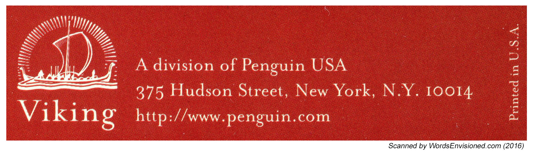
We knew war was imminent in Europe, but we were young and confident, determined to launch a relatively new concept in United States publishing by establishing the American branch of Penguin Books, the highly successful English paperbound house founded in 1935 by Allen Lane.

After landing in New York, Betty, born a British subject, spent her first Fourth of July weekend getting acquainted with her American in-laws, then scoured Manhattan for office space.  She settled on a seventh-floor loft on East 17th Street, just off Fifth Avenue, furnishing a corner with two secondhand desks, three chairs (one for visitors) and a typewriter.  The furniture, a partition, stationery and lumber for shelving in the stockroom took up two-fifths of our cash capital – Betty’s wedding dowry of $500.  This left enough for at least two months’ operation, by which time, we were sure, we would be earning money.  We hired a stockboy (at $14 a week), and as soon as he, the president (Ian), and the vice president (Betty) had built and stocked the shelving with the first shipment of 50,000 books, Ian set off with an armload of samples to obtain orders from what we were sure was an eagerly waiting book trade.

Ian had nurtured a vision of books in paperback covers – quality reading at low cost – since, as a senior at Columbia in 1938, he had written a paper describing the need for, and the possibilities of, soft-cover publishing.  It was an idea he had gone over in detail with his uncle, Saxe Commins, the legendary Random House editor of William Faulkner, Eugene O’Neill and other distinguished authors.  But Saxe had strong opinions; he thought paper-bounds in the United States would never work.

There was reason for such gloomy convictions.  Boni Books, founded in 1929, mostly a mail-order paperback business, had soon failed.  Modern Age Books, founded in 1937, was fast dying, because its owners lacked book marketing savvy.  But Ian felt just as strongly that books in paperback could be revolutionary; a year at the London School of Economics, in late 1938 and early ‘39, had confirmed him in his thinking.  He had seen at first hand that Penguins, the English sixpenny paperbacks (roughly a dime) were practically like coin of the realm, visible in the hands of everyone, from his professors to every Joe and Jane riding the London tube.  The titles published were prestigious and varied.  Several of Ian’s professors were editorial advisers to Allen Lane; indeed, it was one of Ian’s professors who introduced him to Lane.  Lane wanted Penguins to sell in the United States but had been stymied by the existing copyright laws and had had to turn down many offers from other Americans.  Ian researched a solution, whereupon Lane agreed to give Ian and Betty the opportunity to start an American branch that would import his books.  The company was owned 49 percent by Ian and 51 percent by Penguin.

For the first year, Penguin’s entire American operation was run from that loft on 17th Street, quarters with which we all became intensely familiar as we worked there 15 to 18 hours a day, seven days a week.  In the two successive years, we had to move to even larger lofts – so something was obviously working.

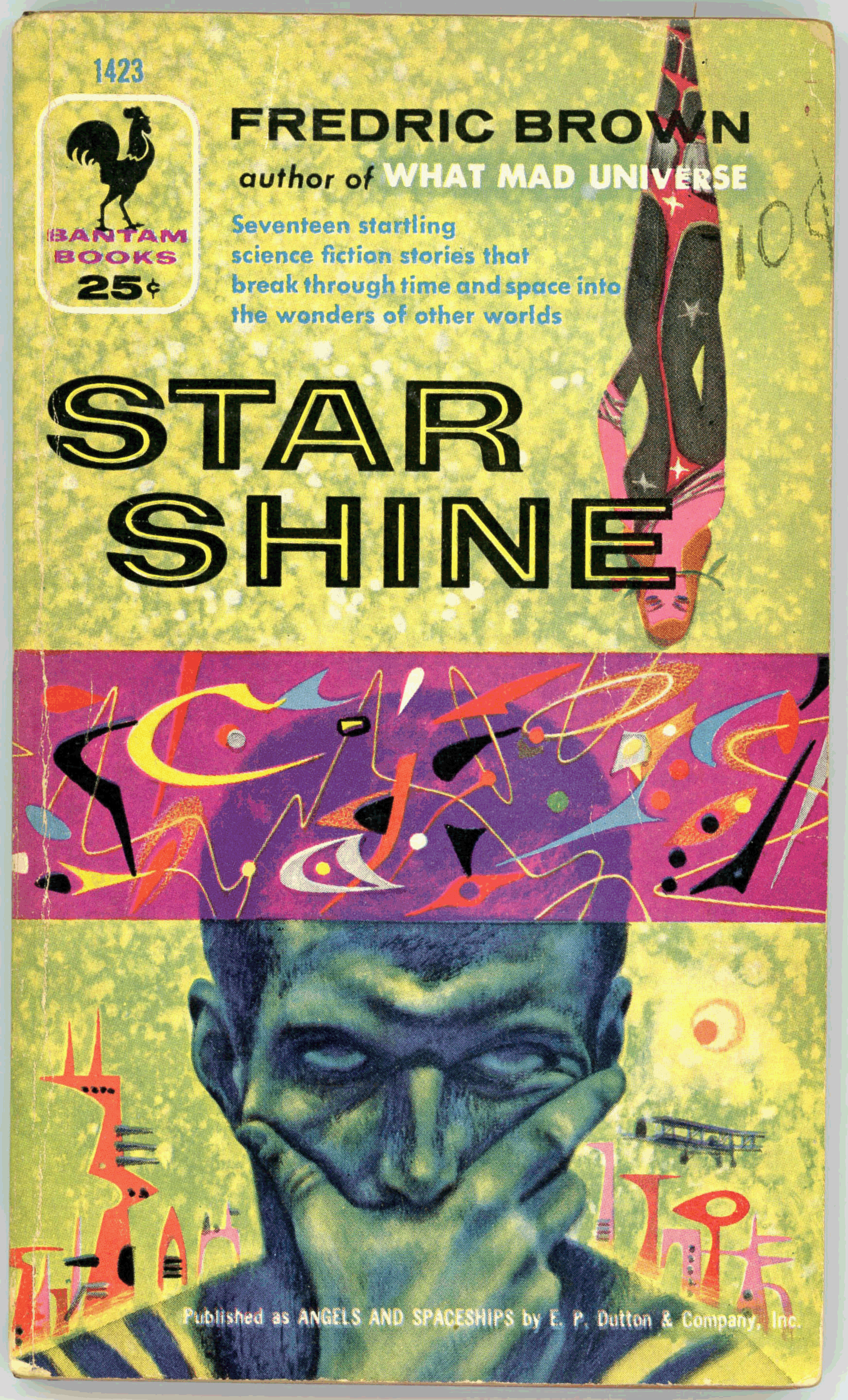
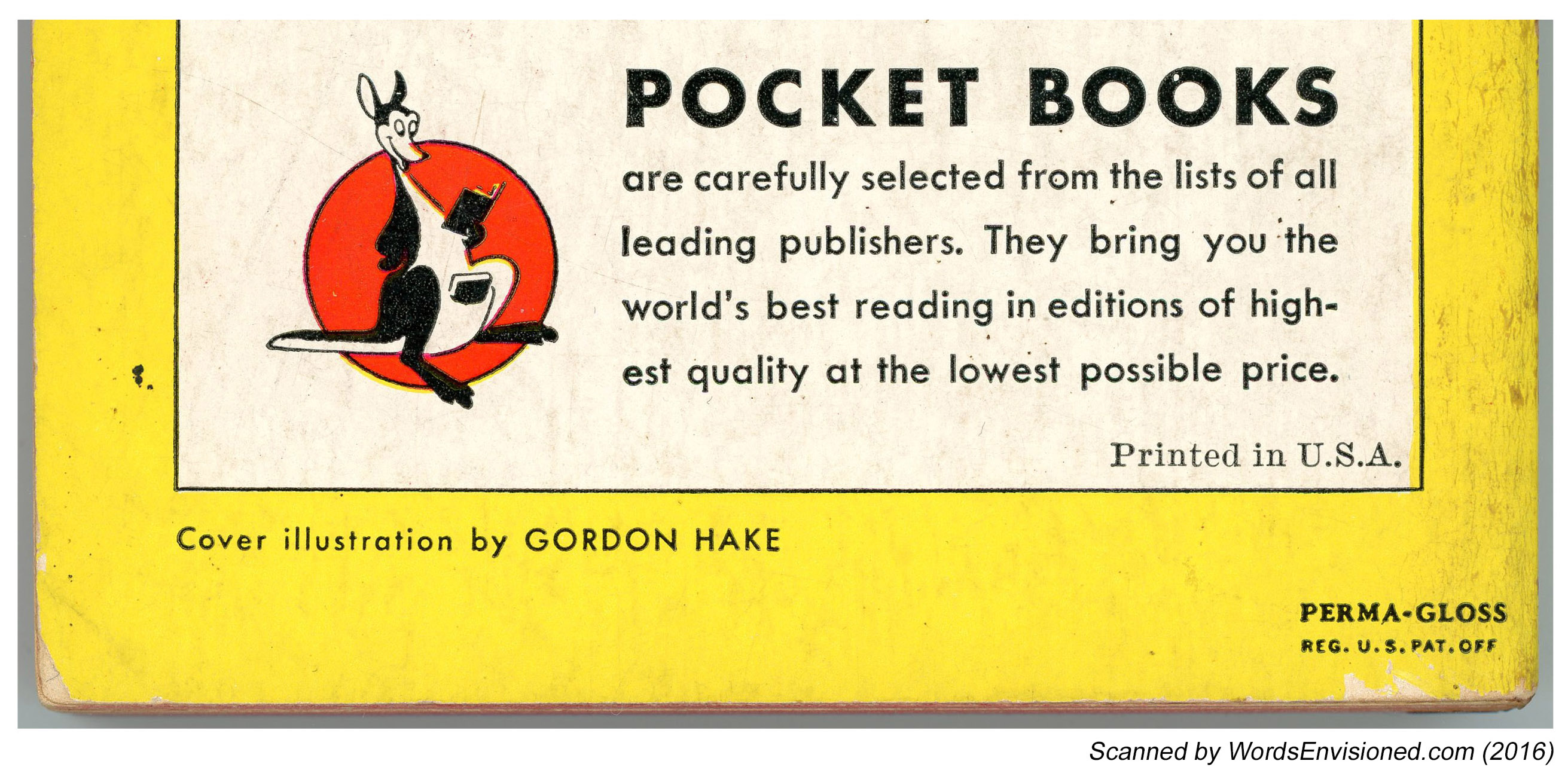
JUST as several teams of scientists announce a breakthrough at the same time, we discovered as we were setting up shop that others had arrived at the same concept by a more conventional route.  Months before we arrived, an operation called Pocket Books had begun work on its own paperback line.  This was a partnership between Simon & Schuster, a well-established publisher of hard-cover books, and Robert de Graff, a veteran of the hard-cover reprint business.  At that time, publishing followed a set pattern – a book was first published in an expensive hard-cover edition at $2 to $3, followed by a hard-cover reprint at 39 cents to 75 cents.  Pocket Books would not be in direct competition, since they would be publishing American books, while we would be importers.  The principal thing Pockets and Penguins had in common, beside their paper binding, was their price – 25 cents – which inevitably led to their being called “quarter books” or “two-bit books.”

Our own line, Penguins, retained their British look – typographical jackets in bright colors, each designating a particular category, the overall size somewhat larger than that of Pocket Books, which, however, featured illustrated covers and endpapers.  At Penguin, with the pick of Allen Lane’s list to choose from, some of the titles we successfully imported included “The Invisible Man” by H.G. Wells, “My Man Jeeves” by P.G. Wodehouse, “Ballet” by Arnold Haskell and a host of novels, biographies and books of travel.  Meanwhile, Bob de Graff, over at Pocket, had begun with an excellent list of classic and contemporary American writers, such as “Wuthering Heights” by Emily Bronte and “Lost Horizon” by James Hilton.

A sad fact that both we at Penguin and the people at Pocket had to face was that there were only some 1,500 bookstores in all the United States at that time.  Of these, only 500 had really good credit ratings.  Americans read magazines.  Those addicted to books got their reading matter largely from public libraries and the lending libraries that rented the latest popular titles for a few cents a day.  So from the start distribution was the major problem, and solving it the key to success.

WE were actually lucky that Pocket Books was in the field.  They had the influence we lacked to make some penetration in the marketplace.  Some stores, like the Doubleday chain, accepted both lines right away, and many department stores featured the new books in their displays.  (When we began, Macy’s was selling more hard-cover books than any other retailer in New York.)  College bookstores, such as the one at Columbia University, were ambivalent.  “Carriage trade” bookstores were generally inhospitable.  It would be another two decades before paperbacks would gain admittance to the prestigious Scribner Book Store on Fifth Avenue.  Even customers who purchased the books found it hard to believe they were getting the whole book, as originally published, for a quarter.  Every copy carried a large notice: “Complete and Unabridged!” And even: “Not One Word Cut!” Still, it took years to convince readers that these small books were not digests.

We found that we could get exposure in drugstores and at large newsstands only by providing racks.  When this was done, the 25-cent price was so low, even for the times, that readers often made multiple purchases, buying four to eight books at a time.  Pete Howe, the intelligently aggressive sales manager at Pocket, persuaded four key magazine wholesalers to handle Pocket Books, and very quickly the salability of paperbounds through “non-book” outlets was proved.  Our wide diversity of titles gave Penguin a secure hold in the new marketplace, and we were able to extend our own distribution through the acquisition of a number of salesmen.

Inevitably, Britain’s declaration of war against Nazi Germany just before Labor Day of 1939 seriously affected our operations at Penguin.  Thanks to the activities of German U-boats, some shipments of books never arrived.  Perhaps worse, the physical quality of the books that did reach us steadily deteriorated because of the shortage of paper in England.  American Penguins had to go into production for themselves; fortunately, by that time we had done well enough to finance such a project.  Our first printing of one of Allen Lane’s war books was Tom Wintringham’s “New Ways of War” – cover art courtesy of Ian’s father, E.J. Ballantine, an actor who also liked to draw and sculpt.  Soon, paper restrictions began to affect American publishers as well.  After December 1941, wartime problems curtailed the number of magazines, and both Pocket and Penguin gained partial distribution through the big national distributors whose magazine wholesalers served 100,000 newsstands, now hurting for material to sell.  Just about anything that could be printed sold, and the sale of paperbound books skyrocketed.  Because so many paperbacks were now selling through magazine outlets, magazine publishers got into the business.  Between 1941 and 1943, three lines whose owners had magazine backgrounds – Popular Library, Avon and Dell – began appearing in the paperback racks.  But lack of paper kept them from growing as fast and as much as they might have.

At Penguin, we were now producing our own original military titles, separate from the British list.  Our first native American product, “What’s That Plane?,” was a homemade aircraft recognition book that we all – our editor, Walter B. Pitkin Jr.; his wife, Suzina; E.J. Ballantine, and ourselves – put together around a large dining room table a couple of Sundays after Pearl Harbor.  We used British Navy sources for our silhouettes of Japanese aircraft.

By mid-1942 we had ten salesmen and a staff of seven, including Kurt Enoch, who would eventually create the prestigious New American Library, and we were now producing just about all our titles, the military books co-published with The Infantry Journal, an official publication of the United States Army, together with many war-oriented reprints.  Imports were a thing of the past.

We published a special edition of “The Moon Is Down” by John Steinbeck, made for the Army Library Service only, presaging the formation of the Armed Services Editions, which would eventually include some of the most prestigious literary works from all the publishers to create free libraries for the servicemen in the field.  The war would produce, among other things, a generation of confirmed paperbound book readers.

Right after the end of the war, we resigned from Penguin Books.  We thought that more of the titles should be American-oriented, with covers designed to appeal to American tastes, while Lane felt the American branch should resume being an importer of British books.  Ian founded Bantam Books in 1945, bringing together a group of hardcover publishers plus the Book-of-the-Month Club and the Curtis Publishing Company as owners of the new company.

We started by reprinting major novelists such as F.  Scott Fitzgerald, John Hersey and Ernest Hemingway, and developed major historical novels and westerns as new categories for paperbounds.  And we sought out new areas of interest with books like “Roosevelt and Hopkins” by Robert E. Sherwood, “Hiroshima” by John Hersey and “Ordeal by Slander” by Owen Lattimore.  These were controversial books, at least in the paperbound marketplace.  Innovation is not something that generally appeals to boards of directors, however, and the introduction of each new category demanded much maneuvering.  One of the biggest crises occurred when we wanted to increase prices to open up our publishing to longer books.  A six-month battle resulted in our going from 25 cents to 35 cents.  With the 25-cent barrier broken at last, and with the longer paperbound books that resulted, the industry had an opportunity to push into new fields.  The higher prices could also increase royalty earnings for authors.  The early paperback reprinters, who previously had decades of hard-cover publications to draw on for their lists, now began to compete for rights.  Guarantees began to leap from the standard $1,500 to startling amounts, like $5,000 and even an occasional dizzying $10,000.  For this kind of money, a paperbound publisher could make contracts directly with the authors, who then could retain the entire amount, rather than sharing it 50-50 with a hard-cover publisher.

INCREASINGLY, we felt the need for freedom to publish what we wanted, and in 1952 we left Bantam to found our own house – Ballantine Books – dedicated initially to publishing only original works.  To us, clearly, original publishing was where the field had to go.

Today, the mass marketplace has become the arena in which a reputation is first created; many exciting young writers, many of whose books are reviewed in this section, for instance, appear first in paperback.  Hard-cover publication follows.  The wheel has come full circle.

As for ourselves, half a century after our marriage, and half a century after the birth of Pocket Books and American Penguin, we are now, we believe, the only surviving founding father and mother of the paperback revolution.  We work only on projects that interest us.  Bantam provides us with a New York office, and gets first crack at anything we dream up.  But our home is actually our workshop and warehouse (things really have come full circle).  Best of all, paperback books are now considered by everyone – writers, booksellers, readers – to be real books.  Only last month, the Nobel laureate Saul Bellow published his novella “A Theft” as a paperback original.

Happy birthday, paperbacks!

Ian Ballantine and Betty Ballantine, founders of Bantam and Ballantine Books, are publishing consultants in New York.

______________________________

1939: The Birth of the Modern Paperback

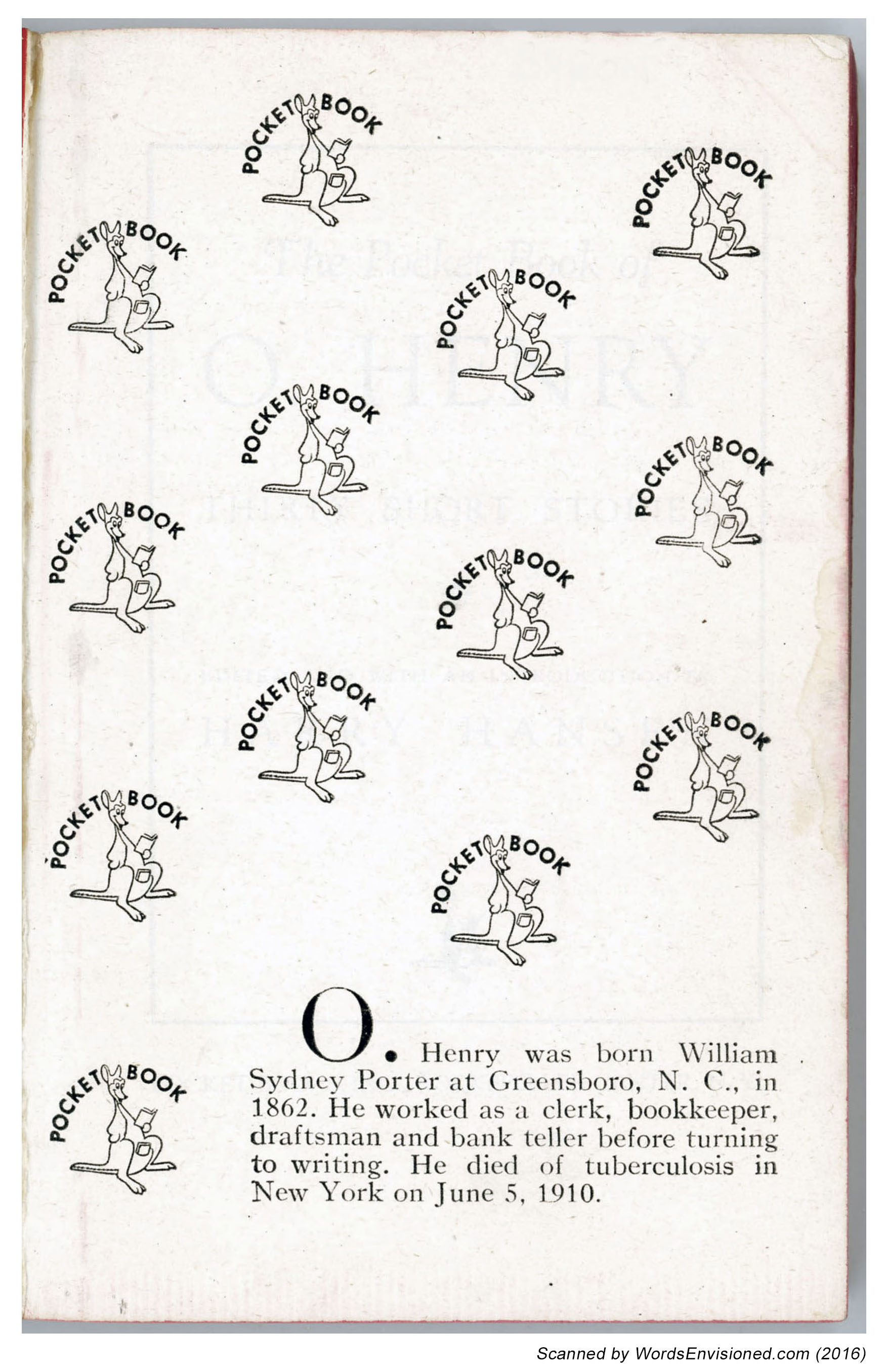
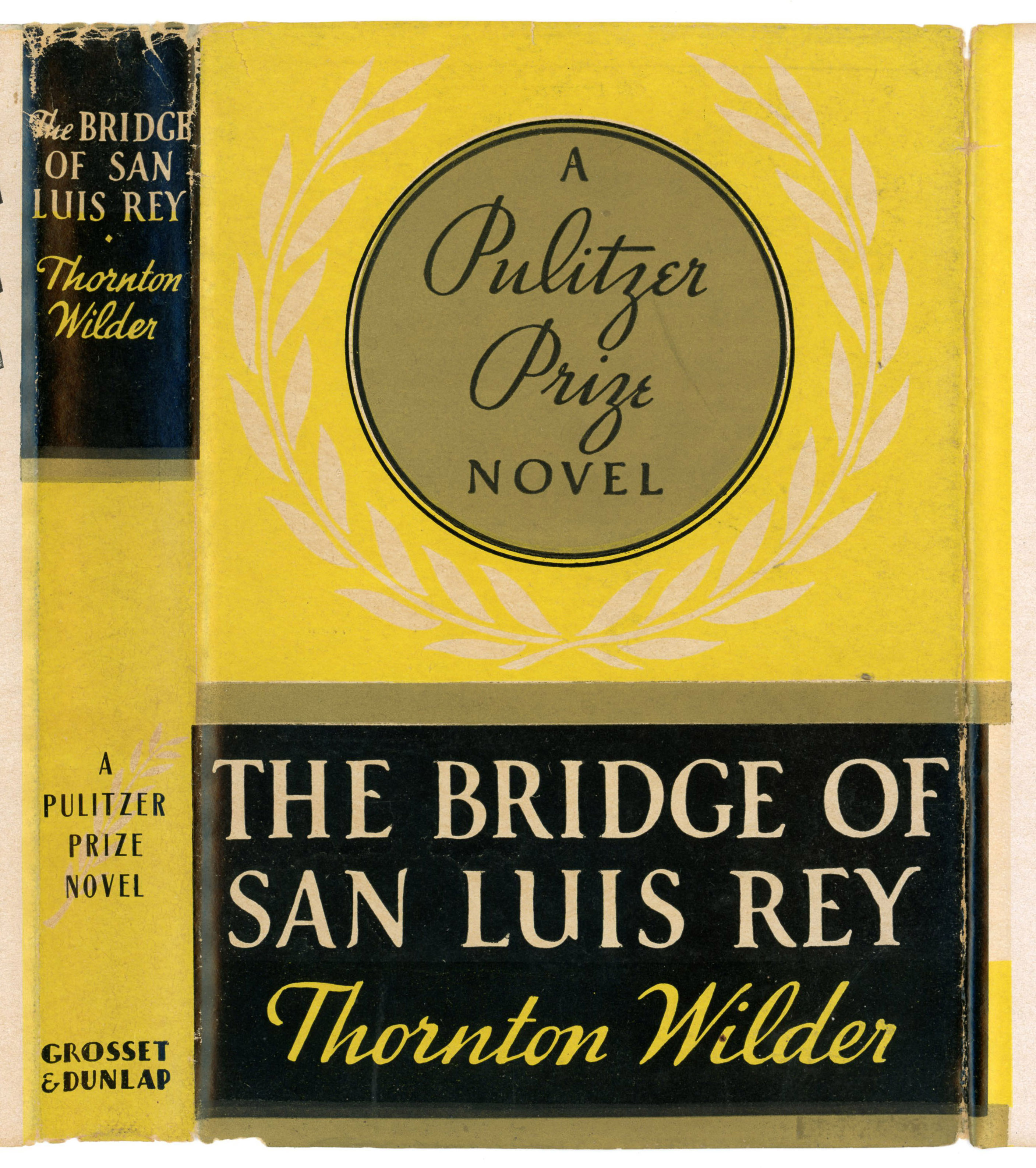
“OUT TODAY – THE NEW POCKET BOOKS THAT MAY REVOLUTIONIZE NEW YORK’S READING HABITS.”  The advertisement announced Pocket Books’ intention “to open up new frontiers of literature … by distributing low-priced books.”  The 4 1/2-inch-by-6 1/3-inch volumes, bound in brightly colored paper covers, cost 25 cents and were sold at drugstores and news-stands as well as bookstores and department stores.  The first 10 titles reflected several years of marketing research.  Three were the bases of successful movies: Emily Bronte’s “Wuthering Heights,” Thorne Smith’s “Topper” and James Hilton’s “Lost Horizon.”  Also included were Thornton Wilder’s Pulitzer Prize-winning novel, “The Bridge of San Luis Rey”; Agatha Christie’s mystery story “The Murder of Roger Ackroyd”; and “Shakespeare’s Five Great Tragedies.”  In its first year, Pocket Books sold a total of six million copies, most notably at outlets where magazines were sold.  In the summer of 1939, the British paperback pioneer Penguin Books began selling its line in the United States.  – RAY WALTERS

Astounding Science Fiction – Decorative Art of the 40s and 50s

B r a s s  T a c k s

October, 1941, by unknown artist (probably Camp, Kolliker, Orban, or Rogers)

__________

January, 1943, by Charles Schneeman.

__________

December, 1951, by Edward Cartier (First appearance January, 1950)

____________________

T h e  R e f e r e n c e  L i b r a r y

December, 1953, by Edward Cartier (First appearance December, 1951)

____________________

S h i p s  o f  S p a c e

September, 1945, by unknown artist

__________

December, 1947 (Masthead), by unknown artist

__________

January, 1948, by unknown artist (only known appearance between 1948 and 1955)

____________________

R a n d o m  A r t

September, 1945, by unknown artist

__________

February, 1950, by Brush (First appearance October, 1949)

__________

July, 1952, by Paul Orban (First appearance?)

__________

December, 1952, by unknown artist (First appearance March, 1951)

__________

October, 1953, by unknown artist (First appearance?)

____________________

A d v e r t i s e m e n t s

Gnome Press

September, 1951, by Edward Cartier (First appearance April, 1951)

__________

Astounding Science fiction

“Moving?  Going to have a new address?”

January, 1952, by Edward Cartier (First appearance May, 1951)