Jamba Mobile App Redesign
UX Research | UX Design | Project Management
This project was an in-depth research and design initiative for Focus Brands. My team was responsible for uncovering the pain points present in the Jamba order ahead app’s consumer journey and redesigning the information architecture based on our findings.
Overview
Problem
The Jamba order-ahead mobile app currently suffers from high abandonment rates - less than 5% of all app sessions lead to purchases. The Jamba team hypothesizes that these numbers are due to unintuitive app design and unclear information architecture.
Project Goal
How can we improve the Jamba application’s consumer journey for new users in order to reduce cart abandonment and increase sales?
My Contribution
UX Research: survey design, field observation, interviewing, personas/empathy map generation
UX Design: wireframing, medium and high fidelity prototyping
Project Management: organized and monitored team schedule, acted as primary contact with business partners
Team
Stephanie Baione, Yiming Lyu, Niharika Mathur, and Shelby Reilly
Client
Focus Brands: Jamba application development team
Timeline
August 2019 - December 2019
Tools
Figma, Adobe Illustrator, usertesting.com, Microsoft Project
Background
After acquiring Jamba Juice in 2018, Focus Brands set out to overhaul the company’s branding. They changed the brand’s name to “Jamba,” overhauled their menu and marketing, and redesigned the order-ahead mobile app. However, the app had a number of problems: it received mixed reviews online, and a significant number of users abandoned their in-app carts before placing orders.
In order to determine the core problems present in the Jamba order-ahead mobile application, the Focus Brands team requested my team’s help in redesigning the application flow in order to reduce cart abandonment and increase sales.


The Jamba App ratings as of August 2019.
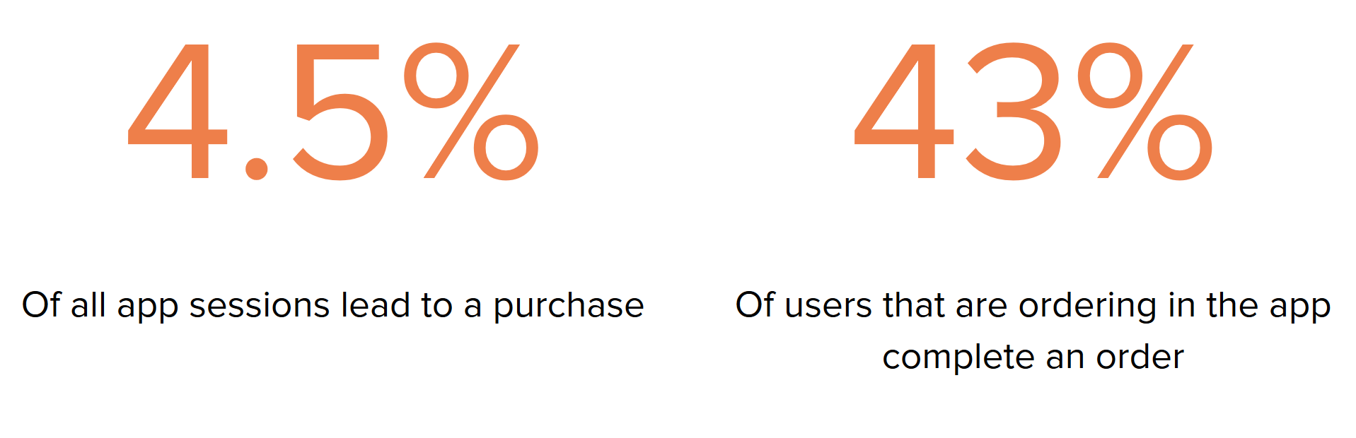
The Focus Brands team’s June 2019 data showed 43% of users who showed intent to order actually purchased something, and less than 5% of all app sessions led to a purchase.

Project Goal
How can we improve the Jamba application’s consumer journey and information architecture for new users in order to reduce cart abandonment and increase sales?
Project Timeline
This project took place from August 19, 2019 to December 16, 2019. As the team’s project manager, I was in charge of developing the team’s schedule, monitoring progress, and ensuring that everyone stayed on track.
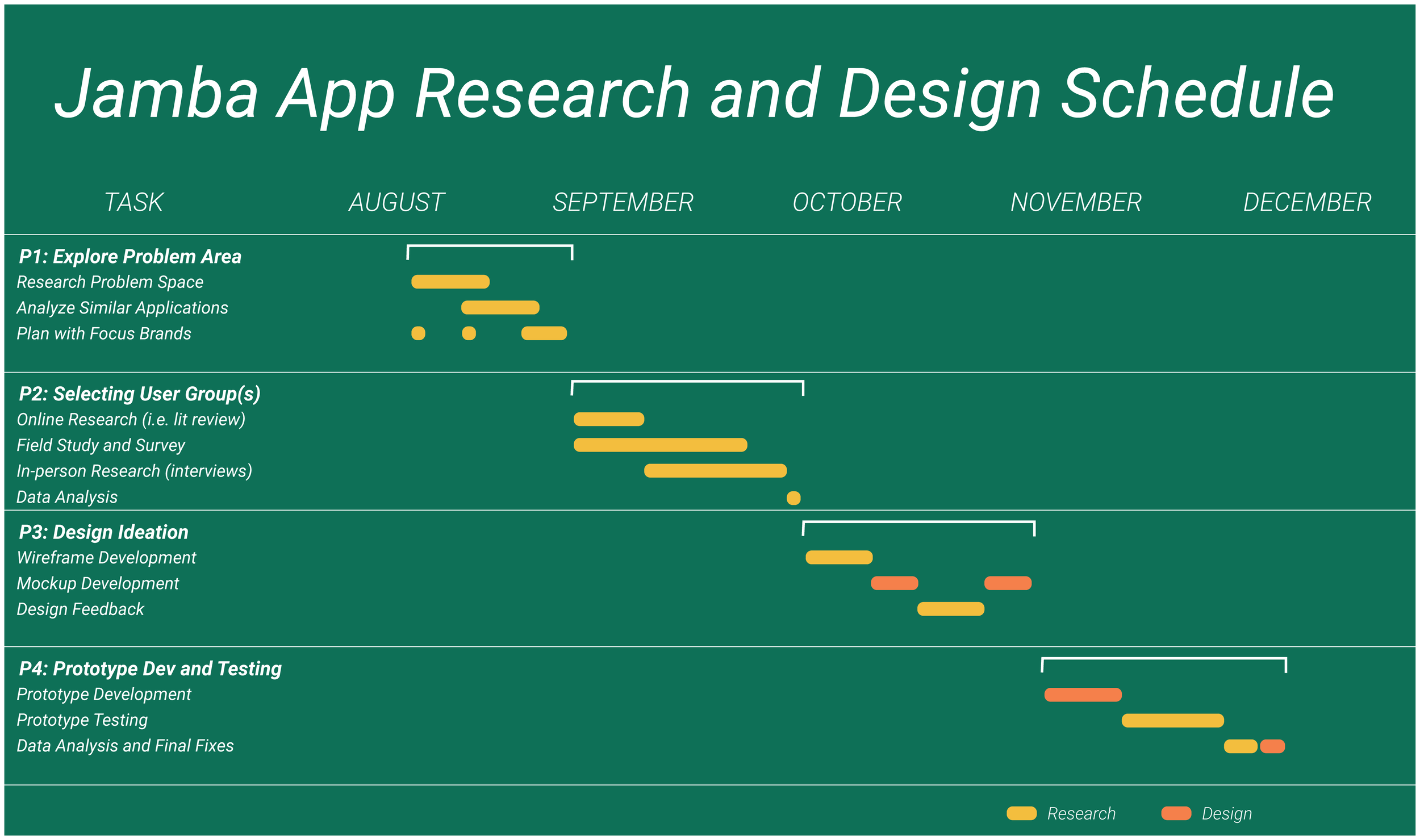
This schedule provides a summarized view of all the research and design work my team conducted throughout this project.
This video shows the in-depth project timeline I developed for my team in MS Project. I created an all-inclusive Work Breakdown Structure for each phase of the project and estimated task durations based on each task’s dependencies and each phase’s deadline.

This project’s main stages, simplified.
Dark green denotes research work, and light green denotes design work.
Phase 1-2: Research

Exploring the Problem Space and Identifying Pain Points
Research Methods
1. Literature Review
2. Task Analysis
3. Competitive Analysis
4. Online Survey
5. Field Study
6. Contextual Inquiry
Literature Review
Our Literature Review consisted of analyzing Focus Brands’ app documentation and analytics, combing through app reviews on the Google Play Store and the App Store, and acquiring information about the current state of quick service restaurants (QSRs) like Jamba in the market.
Research Goals: This research was critical for grounding ourselves in the problem space. Not only did we need to understand the app itself, both in terms of how it functions and how it was being received by our target users, but we also needed to understand the space in the market that it occupies. We hoped to gain necessary context that would inform many of our other research and design decisions.
My Contribution: I took the lead in researching the current state and history of the Jamba application and QSRs in general. I also contributed to the analysis of the app reviews.
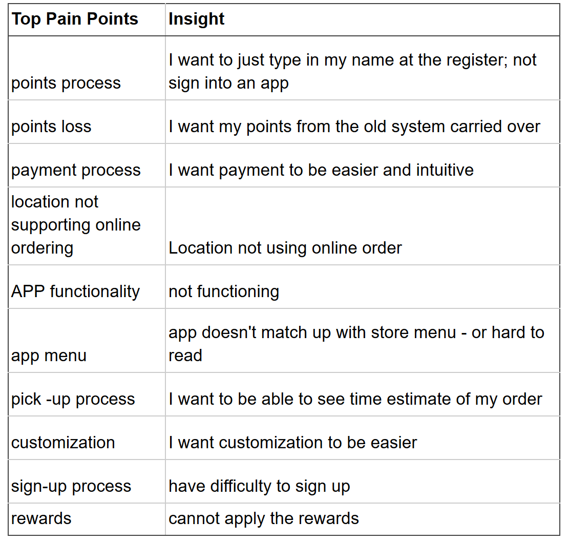
Findings: In addition to gaining a broad understanding of our problem space, we also identified a number of pain points within the application that reviewers online repeatedly mentioned.

Findings: We developed two graphics as a result of this research: the above HTA, showing how a typical user moves through the order process, and a user flow. The user flow is displayed below in our Contextual Inquiry.
2. Task Analysis
In order to improve the consumer journey, we first needed to fully understand it. Our task analysis consisted of visualizing the user flow and developing a hierarchical task analysis (HTA) for the order process.
Research Goals: Since our focus was the consumer journey, which is inherently tied to the user’s movement through the screens, we determined it would be valuable to understand how users moved through the app. Through this work, we aimed to develop resources that would make it easier for us to identify pain points found throughout our research.
My Contribution: I contributed to the development of the user flow and suggested we use the resources from our task analysis as a medium for organizing our research findings.
3. Competitive Analysis
Our Competitive Analysis examined key features of other QSRs’ order ahead apps. The apps we selected to analyze fell into three categories: Jamba’s core competitors (Nektar Juice & Bar, Tropical Smoothie, and Smoothie King), Jamba’s aspirational competitors (Starbucks, Panera Bread, and Dunkin’ Donuts), and frequently-mentioned apps from our Online Survey results (Grubhub and Chick-Fil-A).
Research Goals: While our Literature Review provided us with an understanding of our problem space, we also wanted to understand what Jamba’s competitors and QSRs with well-reviewed order ahead apps were doing. We hoped to understand what the Jamba app was lacking both in terms of functionality as well as in terms of which existing features could be implemented more effectively.
My Contribution: I assisted in selecting the QSRs to be analyzed in this research.
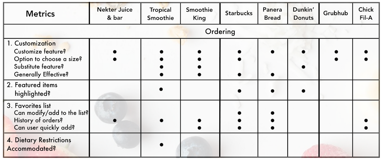

Findings: We developed four graphics from this work. Each graphic contains information on each Jamba competitors’ general, onboarding, ordering (top), and checkout (bottom) features.

Findings: There were 53 total responses to the survey, and we collected a large volume of qualitative and quantitative data with respect to our user group’s habits with QSRs. Above is an example of our survey findings in which 53% of users who use order ahead apps report preferring apps to ordering in stores.
4. Online Survey
Our Online Survey was targeted at our user group, new users of the Jamba app, and was designed to inform us of who exactly these users were with more specificity than online research could provide. We shared the survey with members of our community and left links to the survey in an on-campus Jamba store. We also used the survey as recruitment for our Contextual Inquiry.
Research Goals: While all our previous research methods gathered information from the internet or from the app itself, this Online Survey was our method of collecting general information and connecting specifically with our target users. We believed this would be a critical step for our research, because it would allow us to generate personas of our target users. These personas would be used to inform many of our future decision-making processes with respect to the redesign.
My Contribution: I wrote and edited the online survey questions, organized the presentation of questions within the survey, and contributed to its dispersal to target users.
5. Field Study
In an attempt to better understand Jamba consumers and their relationship with the product and brand, our team conducted observations and interceptions in our local Jamba store.
Research Goals: Our primary goal in performing this research was to gather more information from actual users. We wanted to understand how customers typically approach the ordering process at Jamba, both for in store orders and for order ahead and intercept order ahead customers for more information on their experiences.
My Contribution: I conducted 30 minutes of observations and recorded the activities and possible findings for 6 total customers.
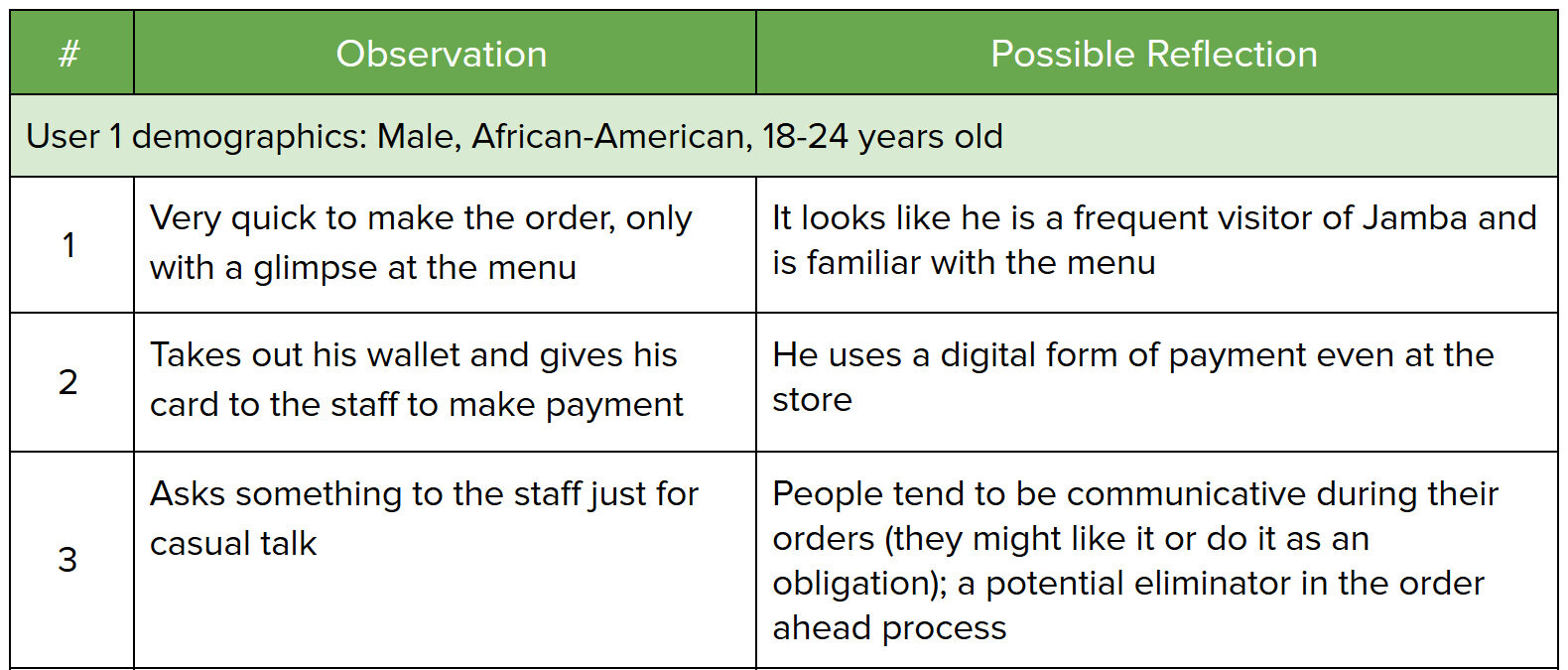

Findings: We recorded our findings for observations (top) as a numbered list of actions and corresponding potential design implications. We recorded our interceptions (bottom) with permission from the participants.

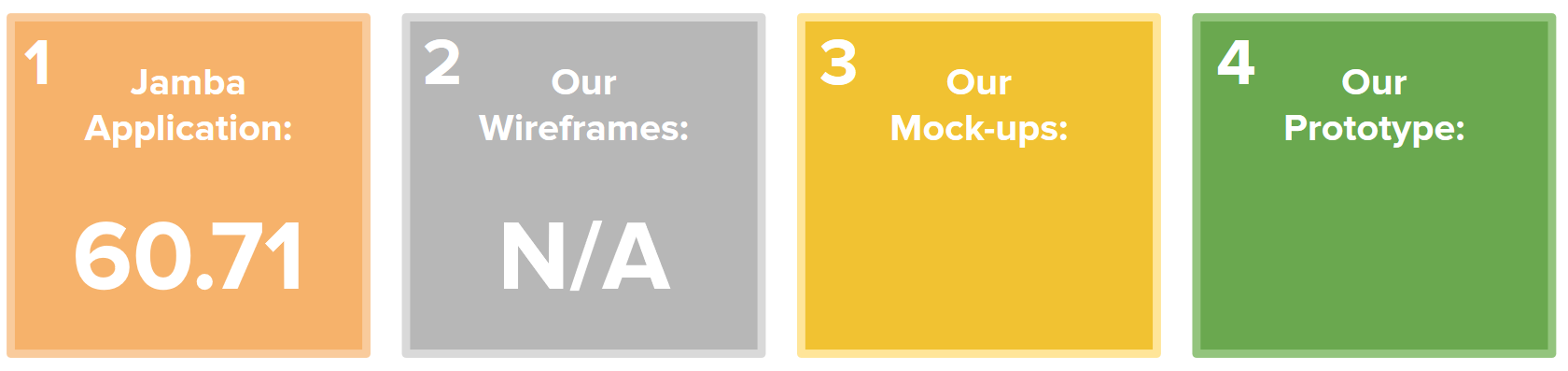
Findings (SUS): The Jamba application as a whole received a SUS score of 60.71 from our users. This rating is slightly below the average usability score of 68.
6. Contextual Inquiry
Arguably the most important and valuable research we conducted during this project, our contextual inquiry consisted of three parts: Application Walkthroughs, System Usability Scale (SUS), and Semi-Structured Interviews. We conducted this research with 7 users who matched the demographics of our target user group.
Research Goals: Through this research, we wanted to observe our target users actually moving through the Jamba app’s sign-up, ordering, and checkout process. We hoped that, by hearing our users talk aloud about their experience with the app, we would pick up on recurring pain points and unexpected areas for improvement within the app overall. We utilized SUS to provide us with a baseline understanding of the usability of the Jamba app as well as a method of documenting our progress in improving usability.
My Contribution: I conducted Contextual Inquiry sessions with 2 participants.

Findings (Walkthroughs and Interviews): After completing all our interviews, we organized all our interview notes into three categories: pain points, good things, and opportunity spaces. We then organized these findings on sticky notes and placed them on our user flow’s corresponding app page. This process allowed us to visualize which portions of the app’s consumer journey had the most pain points and would inform the majority of our wireframe design and development.
Research Findings
The purpose of this initial research was to understand the Jamba application, both in terms of the application itself and the needs it fulfills in the larger food market. Secondly, and most importantly for our redesign, we wanted to understand a new user’s consumer journey in its entirety. For the latter goal, we organized our findings by three “phases:” sign-up, ordering, and checkout.
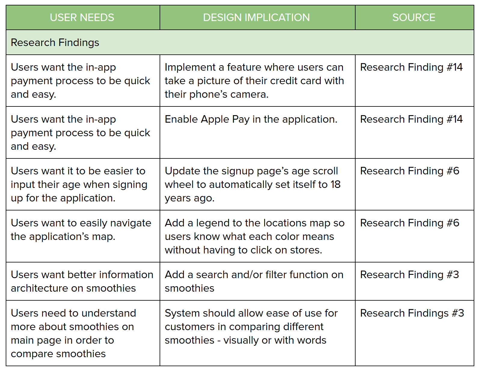
From our research findings, we created a number of design implications to assist us in developing an actionable list of features to implement or change in our design phase.
Sign-up Phase.
Users find the input forms to be unintuitive and cumbersome to use.
Users care about their privacy and protecting their personal information.
Users want to know where they are in the sign-up process.
Ordering Phase.
Users like detailed and clear descriptions of smoothie ingredients.
Users want to directly compare smoothie ingredients, pricing, and calories.
Users appreciate Jamba’s emphasis on health and dietary restrictions.
Users can become overwhelmed by long lists of options, both on the menu and specific smoothie pages.
Users are confused by the app’s presentation of ingredient substitution and addition.
Checkout Phase.
Users want to upload their credit card information as quickly as possible.
Users like having the ability to save and reuse their credit card information across multiple purchases.
Users want to be able to track their order progress.
Users are confused by the current method of locating past orders within the app.
Artifacts
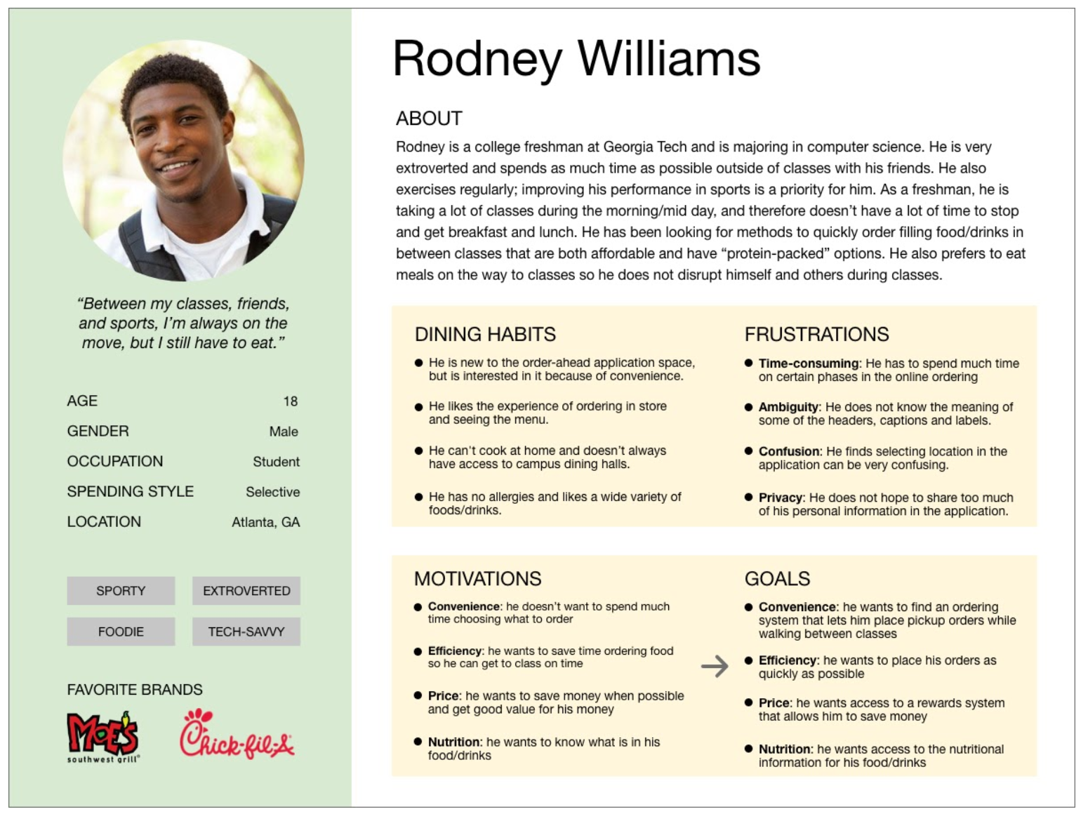
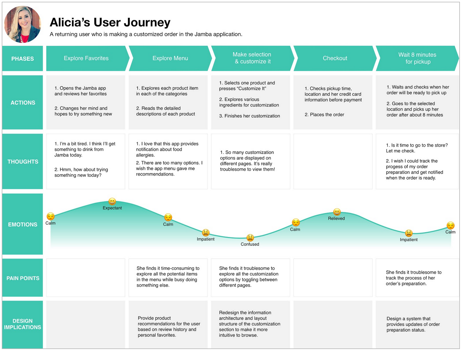
After accumulating our research findings, we distilled our demographic and behavioral findings into personas, empathy maps, and user journeys. These artifacts were critical for our work, because we were able to use these personas to identify the new users for which we were designing. This process was also incredibly valuable for communicating to the Focus Brands team about the difference between the user base we had access to on Georgia Tech’s campus compared to their existing personas.
My Contribution: I worked in tandem with Yiming Lyu to develop all of these artifacts.
Personas

Empathy Maps
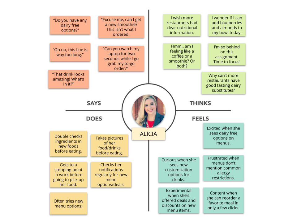

User Journeys

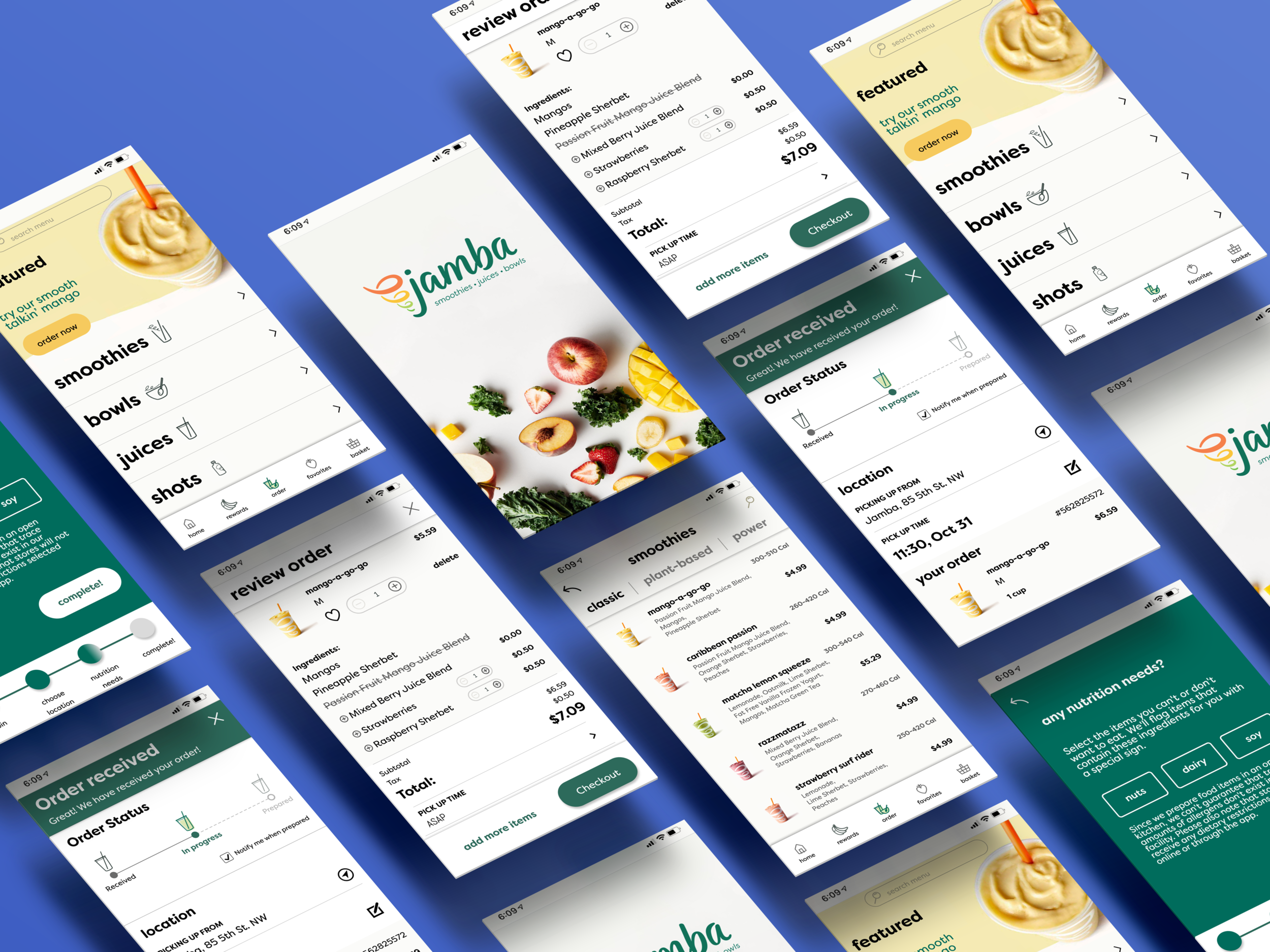
Phase 3: Design
Wireframe and Mockup Design and Feedback
Wireframe Design
Below is a demo of our first wireframes. If you are unable to view or click through the experience, you can also do so here.
User Task: Due to limited time and resources, we were unable to implement a fully functional wireframes and mockups. As a substitute, we defined a series of tasks for the user to complete as they moved through the wireframe. During testing, the interviewer would articulate each task to the user and observe their execution of said task. The tasks are listed below the demo.
Sign up:
Ask the users to sign up on the app (have them enter their date of birth).
Before starting their order, they will be asked to choose their location. At the location page, allow them to explore and give them hints and prompts about clicking anywhere on the screen.
Ordering:
Order a Mango-a-go-go, a Classic Smoothie.
Find the nutrition information for the selected smoothie.
Add strawberries.
Substitute Passion Fruit with Almond Milk.
Checkout:
Add a debit/credit card.
Add a gift card.
Place the order.
Track the order.
Design Decisions
This section will detail how we incorporated changes from our research phase in our wireframe design. The following pictures will show the original Jamba application followed by the wireframe in which a design implication was implemented.
My Contribution: I made the wireframe pages for the Ordering Phase.

Design Implication: Set the birthday scroll wheel’s default date to 18 years ago to reduce the amount of scrolling necessary for sign-up (users must be 18 or older).
Research Finding: Users find the input forms to be unintuitive and cumbersome to use.

Design Implication: Change button label language to more accurately reflect the intended action.
Research Finding: Users are confused by the app’s presentation of ingredient substitution and ingredient add-ons.

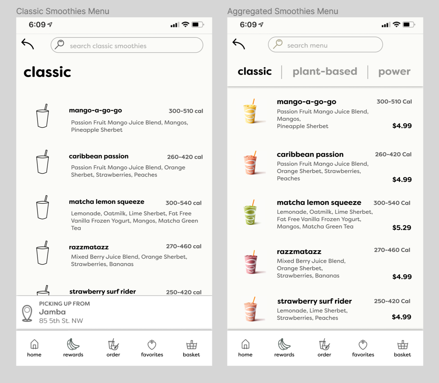
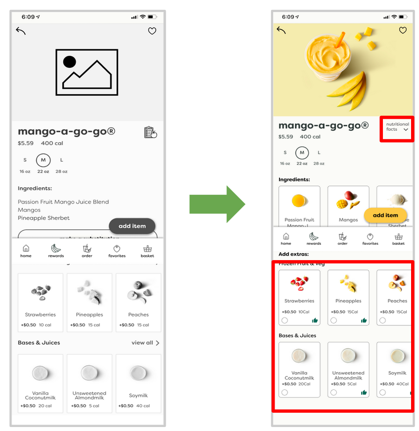
Design Implication: Update the menu to contain more smoothie information that is easily comparable.
Research Finding: Users want to directly compare smoothie ingredients, pricing, and calories.
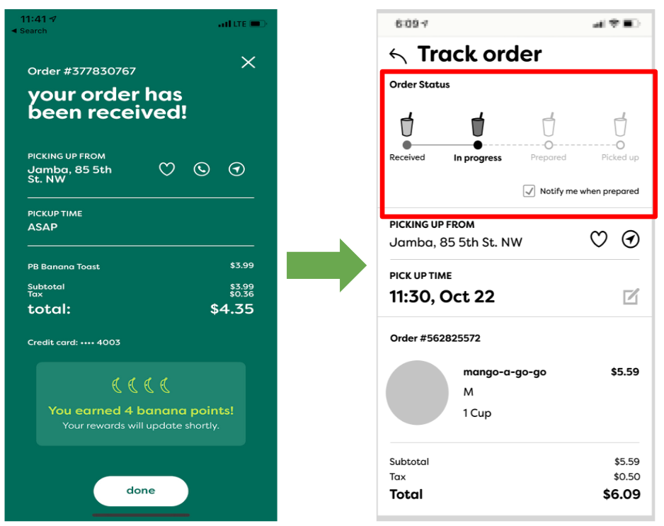
Design Implication: Restructure the order received page to include a live-updating order tracking graphic.
Research Finding: Users want to be able to track their order progress.
Wireframe Feedback
Upon the completion of our wireframes, we set out to validate our previous research findings and acquire new feedback so that we could develop application mockups. This validation process consisted of another phase of Contextual Inquiry and was executed in the same manner as described above in Phase 1-2: Research.
My Contribution: I conducted two Contextual Inquiry sessions during this phase.

Similar to our analysis in the research phase, we accumulated all the notes from our Contextual Inquiry and posted the comments from interviewees directly onto the wireframe in Figma using the comment tool.
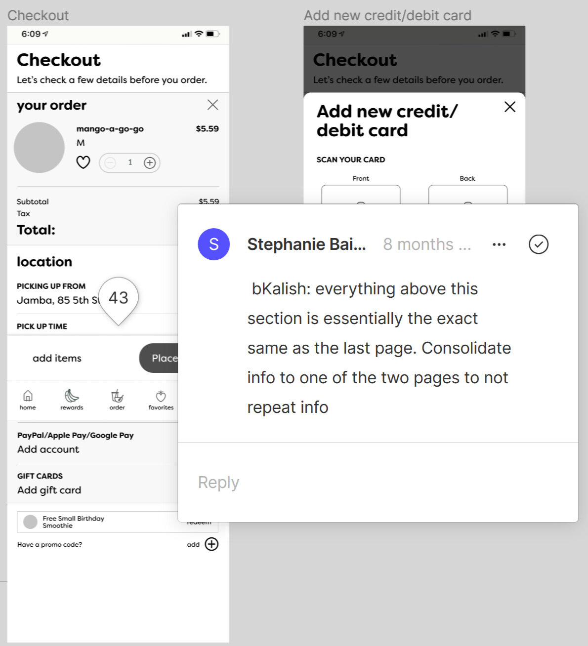
Here we can see a closeup of one of the recommendations a user provided for us on the checkout page.
SUS Survey Results
As mentioned in our discussion of our Contextual Inquiry, we utilized a SUS survey as a means of quantifying the effectiveness of the Jamba app’s consumer journey. During our evaluation of our wireframes, we decided not to have our users fill out a SUS survey. We made this decision, because the wireframes were extremely (and intentionally) low fidelity. We anticipated that users would be distracted by the limited functionality and black and white visuals in our wireframes, and these elements would effect the integrity of our findings.
Mockup Design
Below is a demo of our mockups. If you are unable to view or click through the experience, you can also do so here.
User Task: As with our wireframes, we defined a series of tasks for the user to complete as they moved through the experience. We made a number of changes to the task’s requirements between the wireframes and the mockups in order to account for a few more subtle but critical interactions that our wireframe walkthrough missed. The tasks are listed below the demo.
Sign up:
Task: Sign-up for the application
Enter your information (specifically, select your date of birth)
Select your location and continue (At the location page, allow them to explore and give them hints and prompts about clicking anywhere on the screen)
Select dietary restrictions and continue
Ordering:
Task: Order a mango-a-go-go smoothie with extra strawberries and substitute passion fruit with almond milk
Click on smoothie
Click on classic
Click on mango-a-go-go
Add strawberries
Substitute passion fruit juice for almond milk
Review Modifications
Task: Find nutrition information for the mango-a-go-go
Locate nutrition information
Expand info
Checkout:
Task: Checkout with a debit card and gift card
Review order
Add a debit/credit card
Add a gift card
Place the order
Track the order
Finish
Design Decisions
This section will detail how we incorporated changes from our wireframe feedback into our mockup design. The following pictures will show the wireframe followed by the mockup in which a design implication was implemented.
My Contribution: I made recommendations for critical design changes based on our wireframe feedback.

Design Implication: Create separate buttons for sign-up and login functionality.
Wireframe Feedback Finding: Users find it confusing that login and sign-up are treated as one action.
Design Implication: Add more visual cues to demonstrate a selection has been made and identify recommended or “frequently selected” additions.
Wireframe Feedback Finding: Users struggle with the additions/extras selection process.

Design Implication: Implement a review order page that displayed order details and updated depending on extra costs.
Wireframe Users wanted to review the changes they made to their order and how those changes factored into the basket price.

Design Implication: Reorganize the information on the track order page based on importance to the customer.
Wireframe Feedback Finding: Users were confused by the hierarchy of information on the track order screen.
SUS Survey Results
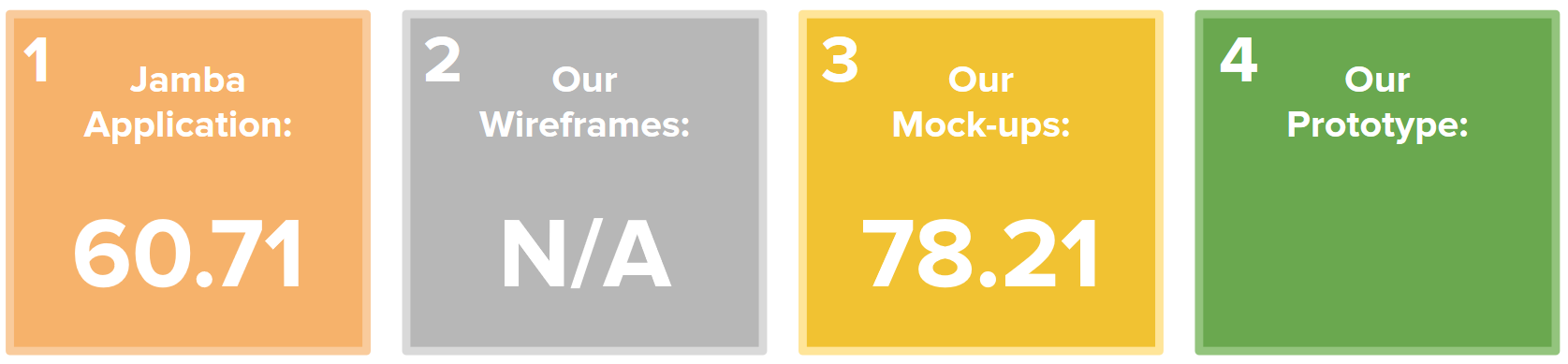
Given that our mockups were a much higher fidelity than our wireframes, we believed it would be valuable to conduct another round of SUS surveys. Our intent in reevaluating SUS surveys at this phase was to realign ourselves with respect to how successful our redesign efforts were. We had a goal that, by the end of our redesign, we would achieve at least a SUS rating of at least a 68, which is considered average.
As such, we were excited to calculate our mockup’s SUS evaluation at 78.21. Based on these results, we were able to ascertain that we were moving in the right direction with our work and that we could move our goalpost for our prototype design. At this phase, we hoped to reach a SUS score of 80 or above for the final phases of our redesign.
Phase 4: Evaluation and Validation

Prototype Demo,
Validation Testing,
and Final Evaluation
Prototype Demo
Using feedback received from testing our mockups and the Expert Evaluation (described below in Validation Testing), we generated a final version of our Jamba application redesign. This process was done similarly to the other phases of redesign in Phase 3. Below is a demo of our final prototype. If you are unable to view or click through the experience, you can also do so here.
User Task: Similarly to the previous design iterations, the user tasks are listed below the demo.
Sign up
1. Start by clicking on the screen, then go through the Sign-up Process as a new Jamba Member--including completing your settings.
Ordering
2. Find a smoothie called ‘pb chocolate love’ and click on it. You change your mind and decide to check out a different smoothie. To do so, click on the order tab to go back to the main order screen in order to continue to the next task.
3. From the order tab, order a smoothie called ‘mango-a-go-go.’ Add Extra strawberries and raspberry sherbet. Substitute passion fruit mango juice blend with mixed berry juice blend. Add the smoothie to your basket.
Checkout
4. Proceed to your basket and check out. Open the pop-up to add a gift card, assume your card info has been added and click ‘add card.’ Then open the pop-up for adding a debit card, assume your card info has been added and click ‘add card.’ Proceed to complete order.
Validation Testing
Unlike the Design Phase, the purpose of these research endeavors were to evaluate our prototype’s effectiveness and usability, not revise it. The findings from these tests would be incorporated into our final recommendations for the Focus Brands team as well as define the successes and limitations of our completed redesign.
We utilized three testing methods, which are enumerated below:
1. Expert Evaluation
2. Unmoderated/Remote Evaluation
3. In-Person Evaluation
1. Expert Evaluation
We performed a Heuristic Evaluation of our application with 3 research and design experts. These experts were professors at Georgia Tech.
Research Goals: We sought to critically evaluate the usability of our prototype using an industry standard technique as well as incorporate expert advice into our final recommendations to the Focus Brands team. We had a goal of receiving a score of 10 or less from this evaluation.
My Contribution: I acted as both an interview moderator and a note taker during this process.
Findings: Upon the completion of this evaluation, we realized that we failed to reach our success score of 10 or lower. As a result, we incorporated a number of the recommended changes from our experts in the User Control and Freedom, Consistency and Standards, and Error Prevention heuristics, because all the experts expressed issue with those areas.
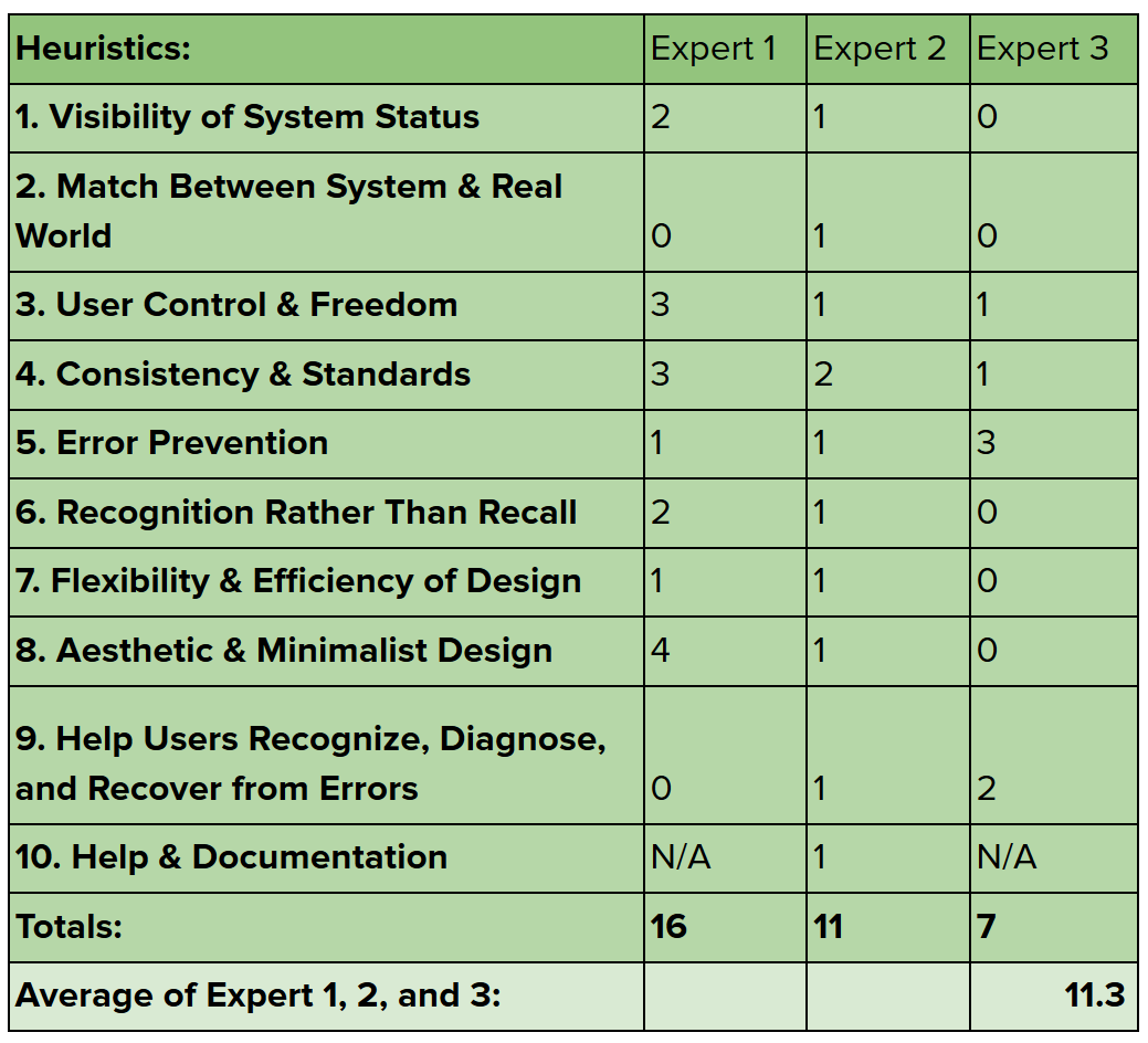
Above are the results of our Heuristic Evaluation. The experts rated each heuristic from a score of 0 (no usability problem) to 5 (usability catastrophe). Our average usability problems averaged at 11.3.
A Usertesting.com user filling out SUS survey questions after completing their walkthrough of the application.
2. Unmoderated/Remote Eval
We utilized Usertesting.com to conduct a remote and unmoderated evaluation of our application’s consumer journey. We received feedback from 3 users who self-reported as new users for the Jamba application.
Research Goals: Because all of our previous testing had been performed in-person and with moderation, we believed it would be critical to show that our consumer journey was usable without direct assistance or influence from a researcher present. Therefore, we aimed to acquire primarily positive qualitative feedback as well as surpass our previous SUS rating of 78.21.
My Contribution: I assisted in analyzing the SUS results and qualitative feedback from participants during this evaluation.
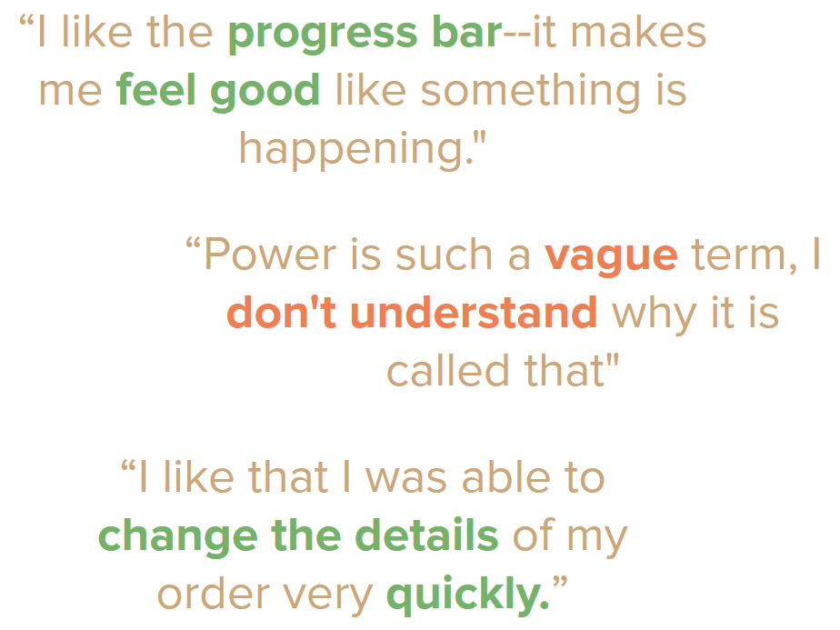
Findings: We received a variety of qualitative feedback from this evaluation. Many of the comments were positive, referencing the ease and flow of the consumer journey, while others expressed confusion with in-app terminology (see the text to the left). Additionally, we received extremely positive reviews in the form of SUS ratings, scoring a 88.7 overall from our remote users. Finally, we recorded the speed at which users completed tasks, which we would use to compare with and validate the results of our in-person evaluation.
3. In-Person Evaluation
In order to directly compare the Jamba application to our prototype, we performed an A/B test where we asked 6 users to complete the same tasks using both versions of the application. We alternated which version was given to each user in order to limit bias towards either of the applications.
Research Goals: Our goal for this evaluation was to prove that our application was more intuitive than the original Jamba application. We would prove this hypothesis by measuring how long each task took to complete and comparing the cumulative completing times of the original application to our version. We also conducted SUS scores for this evaluation and were again aiming to surpass our previous score of 78.21.
My Contribution: I prepared the evaluation’s tasks and analyzed the SUS and qualitative findings.
Findings: Overall, we found that 5 out of 6 users preferred our redesigned application flow, and the average participant spent 29.7% less time completing a task in our prototype versus the original. Additionally, we received a SUS score average of 95 from these users.

The average rates at which users completed tasks, each task’s success rate (out of 6 users), and their average reported satisfaction completing each task.
Final Evaluation
1. Summary
2. Recommendations
3. Research Limitations
4. Self Reflection
Summary
Over 16 weeks and through multiple iterations of the user centered design method, our team redesigned the Jamba application’s consumer journey and information architecture. Our final prototype, validated through in-person moderated testing, remote unmoderated testing, and expert review, proved to be notably more usable, efficient, and well-received by users. These findings are supported by: qualitative responses where 5/6 users reported preferring our prototype to the existing application, 9 total evaluation users spending 29.7% less time completing tasks in our prototype, and a 32.21 improvement in overall SUS score over the course of our redesign.

The above image represents our recorded SUS reports during each phase of our redesign, resulting in a final SUS rating of 92.92 for the final prototype.
Recommendations for Focus Brands

Menu Page Visibility
Users want to make direct comparisons between items with the fewest possible clicks.

System Usability Status
Clear communication of progress through the application makes the system more familiar and predictable.

Label Predictability
Naming conventions should be consistent both with other systems within the application and reflect the action the user expects to take.

Consistency
Core functionality should be implemented in the same way throughout the application to build familiarity with internal systems.

Dynamic Information
Users want the flexibility to compare and manipulate information within the application in order to make informed decisions.
Research Limitations
We were a team of student researchers working on a college campus. As a result, we had a limited user scope compared to Jamba’s target user personas and had small sample sizes. Additionally, our primary user group, new users, is extremely difficult to reach in context and to recreate artificially in a research environment. We also suffered from limited comparison testing, because we only had time to implement one of many potential consumer journeys through the application. This feature of our research also limited our actionable quantitative data.
Therefore, we recommend to the Focus Brands team that they implement our recommendations and perform an A/B test to validate our findings.

Self Reflection
This was my first major UX research undertaking. Before working on this project, I had designed and programmed a number of mobile and web applications from the perspective of a developer. This process opened my eyes to the value of UX work as a mechanism for improvement and optimization. Oftentimes, a UX project will not start from scratch - need for projects such as these come from recognizing that one’s existing systems are falling short of user needs and seeking to understand why. And while the process of answering those questions requires a variety of things you would expect, such as research methods, iteration, and testing, it also requires trust. By trust, I mean trust in your users and the findings they give you. Sometimes, the conclusions you draw are unexpected or undesired. One of our critical design recommendations for this project, the “Order Received/Status” page, was met with hesitation by the Focus Brands team. However, we decided to continue to include it in our recommendations because our users so universally praised this feature.
Trust is not only extended to users, but also to teammates. As project manager, a role that my team entrusted to me despite having only known me for a week, I worked with my team to generate a team contract so that we could understand each other’s goals and expectations. I can now say confidently that the best teams are ones who never need to draw on formal documents such as team contracts to guarantee a high quality of work. We had open lines of regular communication, consistent meeting times that we all worked hard to meet, and deadlines we all respected. They also became some of my best friends. Such teams with high trust and mutually understood expectations are teams that I will strive to join and foster when I move into professional environments, as I have never experienced such an environment of high productivity prior.
After this project, I have realized that there are still many things I can work to improve about my own process. Some of our initial research methods and findings ended up being relatively superfluous compared to others. This project reasserted to me that quality trumps quantity. And to reiterate the value of quality research, designing research methods that generate findings about various research questions will save a significant amount of time in the long run. Additionally, as a project manager, I need to remember the importance of trust in teammates and develop project environments and artifacts that give my teammates all the information and organization they need to be efficient with their work.
To everyone who helped in the completion of this project, including my wonderful teammates, my professors, the Focus Brands team, and most importantly our users, I would like to extend a sincere thank you. It was a joy to work with you.
And finally thank you, reader, for coming along on this journey with me.
Check out some of my other work below.