App bar
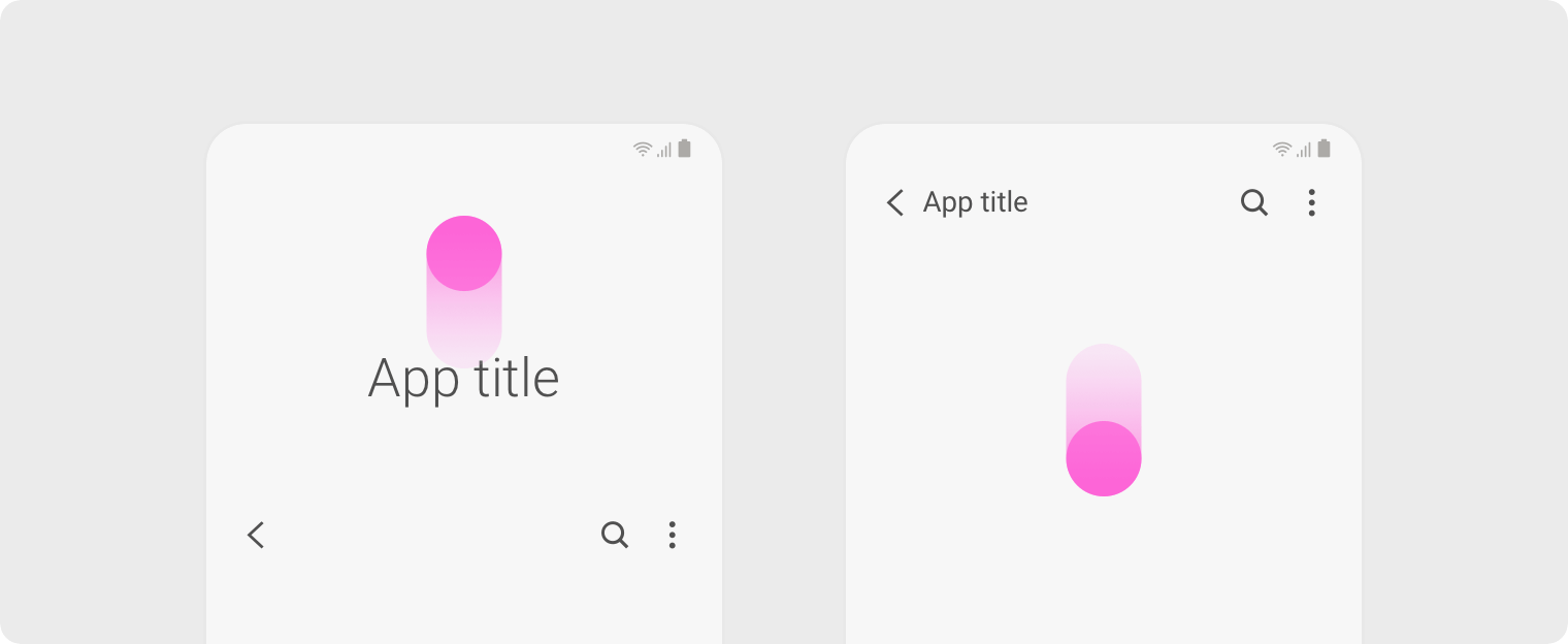
- App bars appear at the top of apps. They include the title of the app or page, the main functions available from that location, and navigation options. One UI provides two app bar styles: a standard condensed form and an extended app bar. The condensed form allows for more content on the page. The extended style allows for more information about the app and brings functions and buttons lower down on the screen so they're within easy reach of the user.
- When the user scrolls down, the extended app bar condenses to the standard height to show more content on the page. If the user scrolls up, then the app bar expands again. As the app bar changes size, the components rearrange to be in the right place for each style.
- If the user leaves the app and comes back, then they'll find the app bar in the exact same condition that they left it in, either expanded or collapsed.
- Some apps even use dynamic titles in extended app bars to show extra info or functions. This can include the number of unread messages, the next alarm time, or links to frequently-used places.
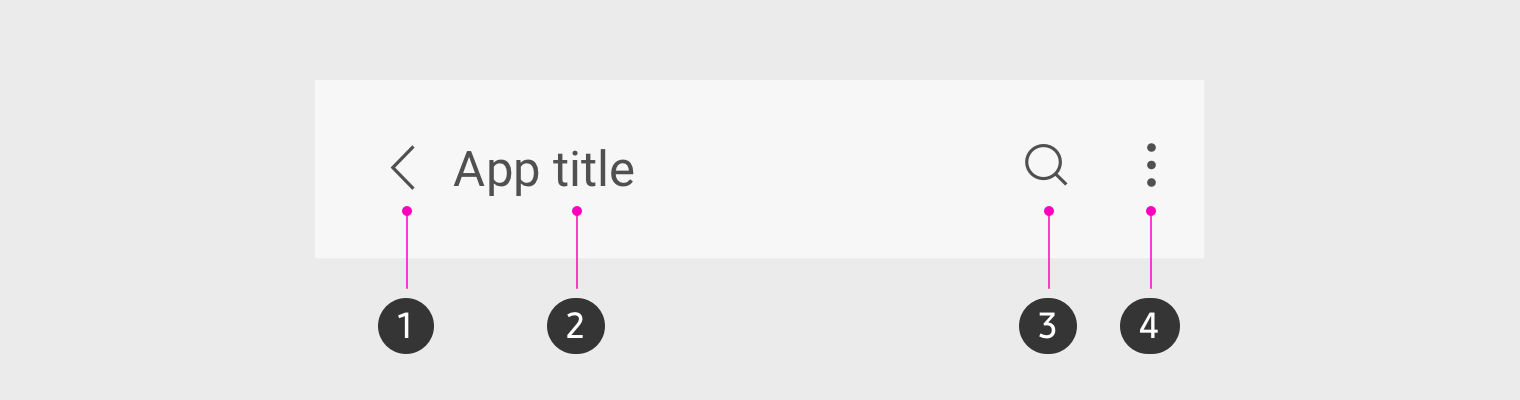
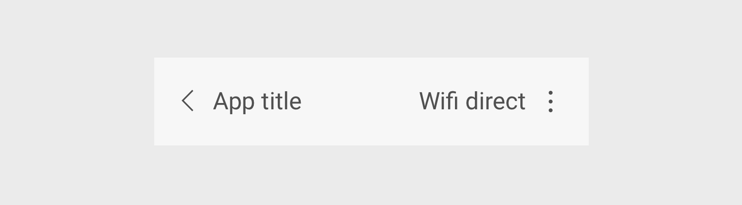
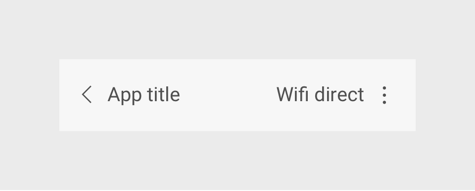
①Back
②Title text
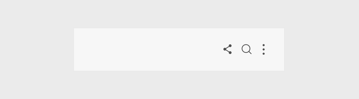
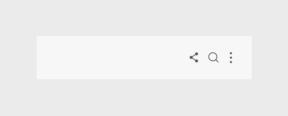
③Action button (Search)
④More
Find out more on
-
Basic form of app bar
Android Developers
-
Extended form of app bar
Material design
Title
- Normally, the title of the app or page appears right in the center of the expanded app bar. Any additional info or notifications are shown below.
- If there's important information users need to see, the name of the app or page can be replaced by a sentence. This is called a dynamic title.
- Dynamic titles can have up to two action buttons below them. If the text is too long to fit in the designated title area, then you can automatically resize it. If it's still too long, use an ellipses or break off some of the information into a subheading beneath the title.
Action button
- The action buttons located on the right side of an app bar give users quick access to the main functions on the screen. Functions that are difficult to symbolize as icons can be shown as text buttons.
- Action buttons are optional and can be provided only when necessary. We recommend no more than three buttons on any page.
Action buttons displayed in icons
Action buttons written in texts
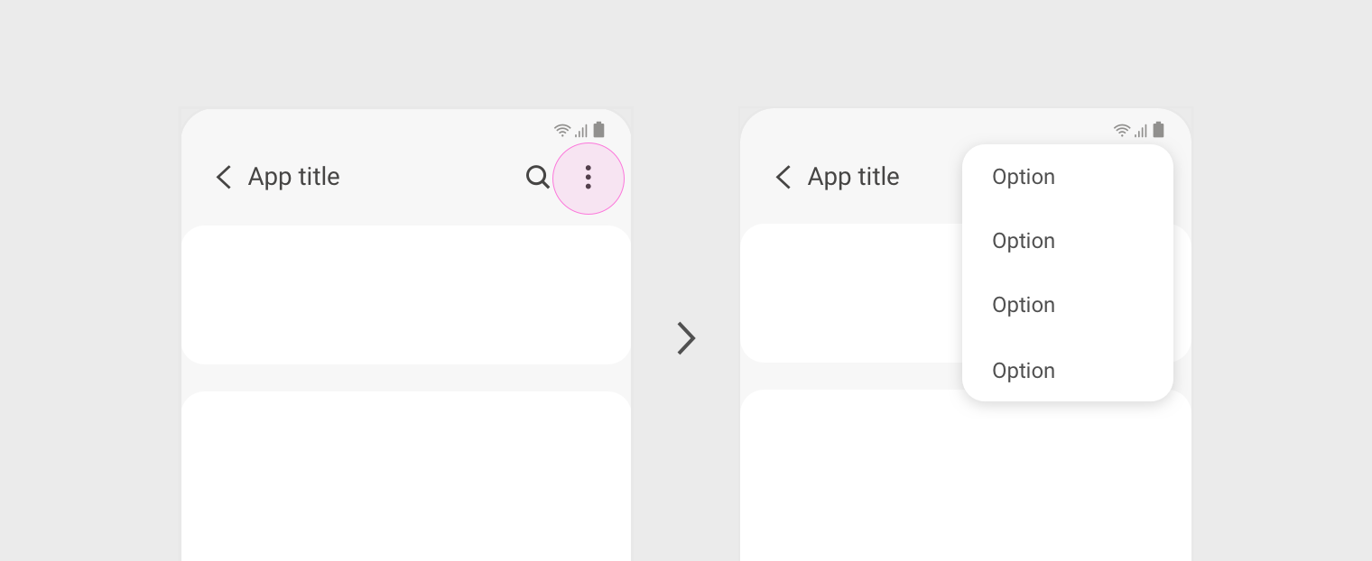
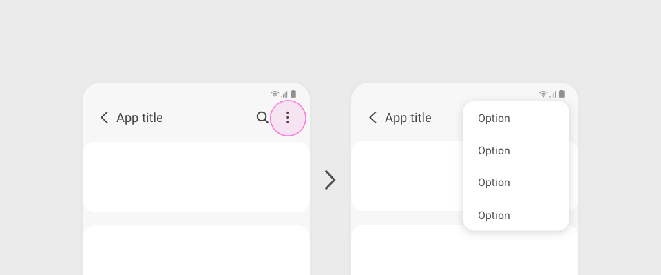
More option
- The More options button on the far right side of the app bar provides additional actions, functions, and settings. This menu can be used if the title text is too long to allow for icon buttons, if there are already too many header buttons already, or if you just want a sleek look on the page.
- In One UI, we indicate when an option is on or off in the More options menu with a checkbox.
Related sections
- Basic layout