30 Days of Blogging: Day 16
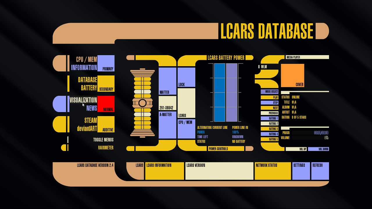
Don’t know if this is Google’s plan, but I have noticed that the recent changes that Google has been making to Material Design, the format it is using for its apps, seems to be very similar to the Star Trek: The Next Generation layouts for computer displays called LCARS. Library Computer Access/Retrieval System or LCARS is the operating system that the computers use for Star Trek during the period when The Next Generation takes place. I would often get and use any type of app, font or layout that used this format back in the early 2000s. I would customize my Windows backgrounds, I even had a desktop background based on this and would rearrange my icons so that they would match up with the areas in the LCARS where someone would interact with those items.
This would be an interesting development and I don’t know if it’s tied into Google’s new operating system, Fuschia, but I would be all over it. I have always thought that LCARS was an interesting way to show and use data on a computer, much better than the linear method that we have been using since the early years. With its blend of graphics, text and touch screen I’m kind of surprised that other companies have not tried to create something similar. Now with all of the rounded corners, half circles, and whole circles, for the labels and other text boxes, it really looks like Google is moving in this direction.
I’ve look in the Play Store and in Chrome to see if anyone has developed something already for any of my devices and it looks like there isn’t a whole lot. So it will be interesting to see where Google takes this

You must be logged in to post a comment.