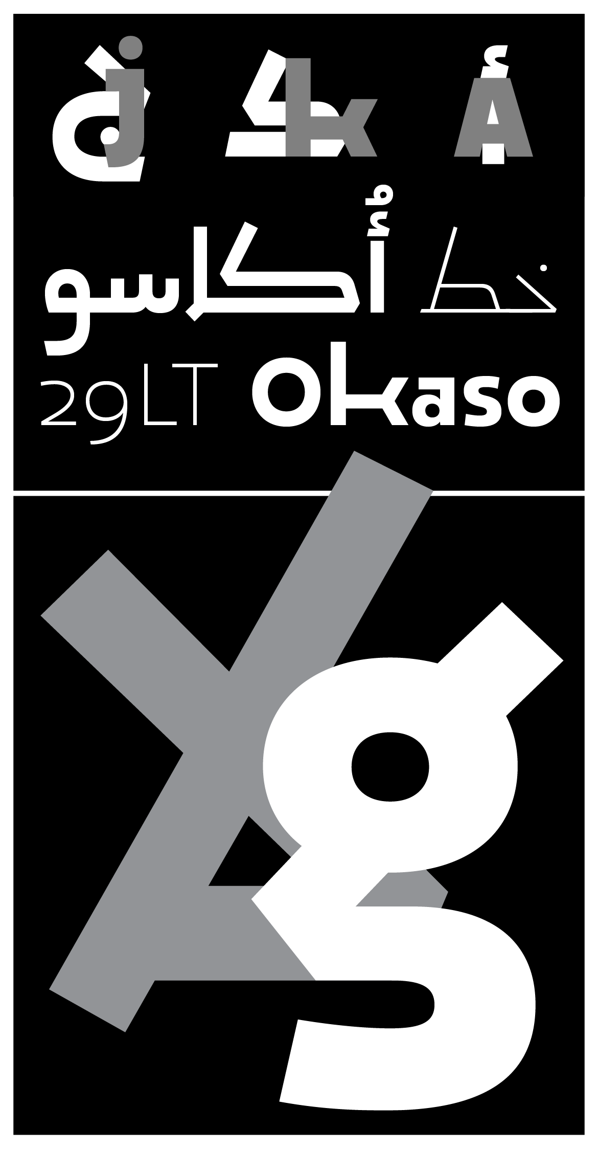
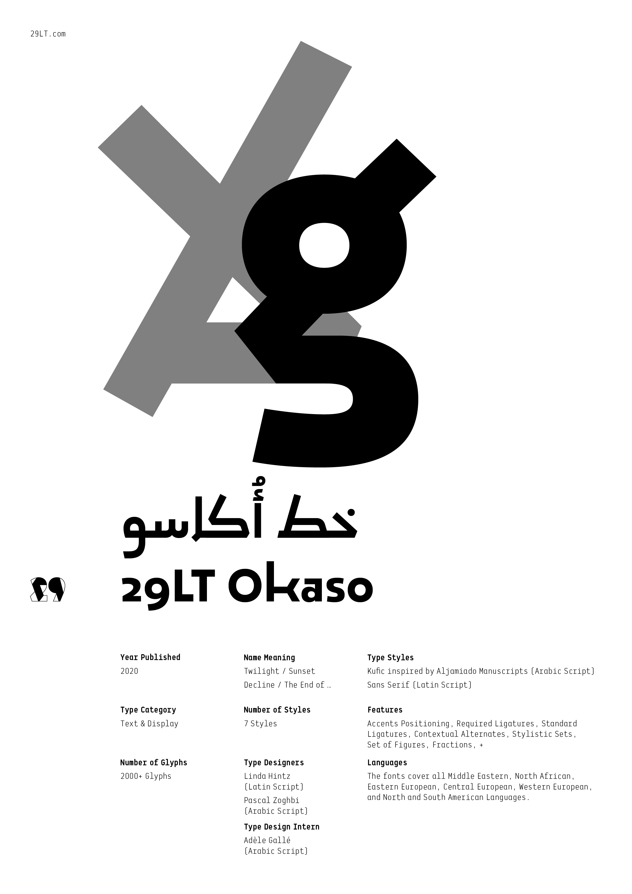
29LT Okaso is a vibrant geometric typeface with distinctive letterforms. The outlines of its letters challenge traditional structures while preserving legibility. It incorporates a carefully studied balance between solid forms and dynamic contours, giving it a lively feature within a corporate and serious existence. The Arabic character set is inspired by a unique set of letters found in vernacular Aljamiado manuscripts, and its accompanying Latin is drawn with alternating letterforms to echo the active nature of the Arabic script and its lively flow.

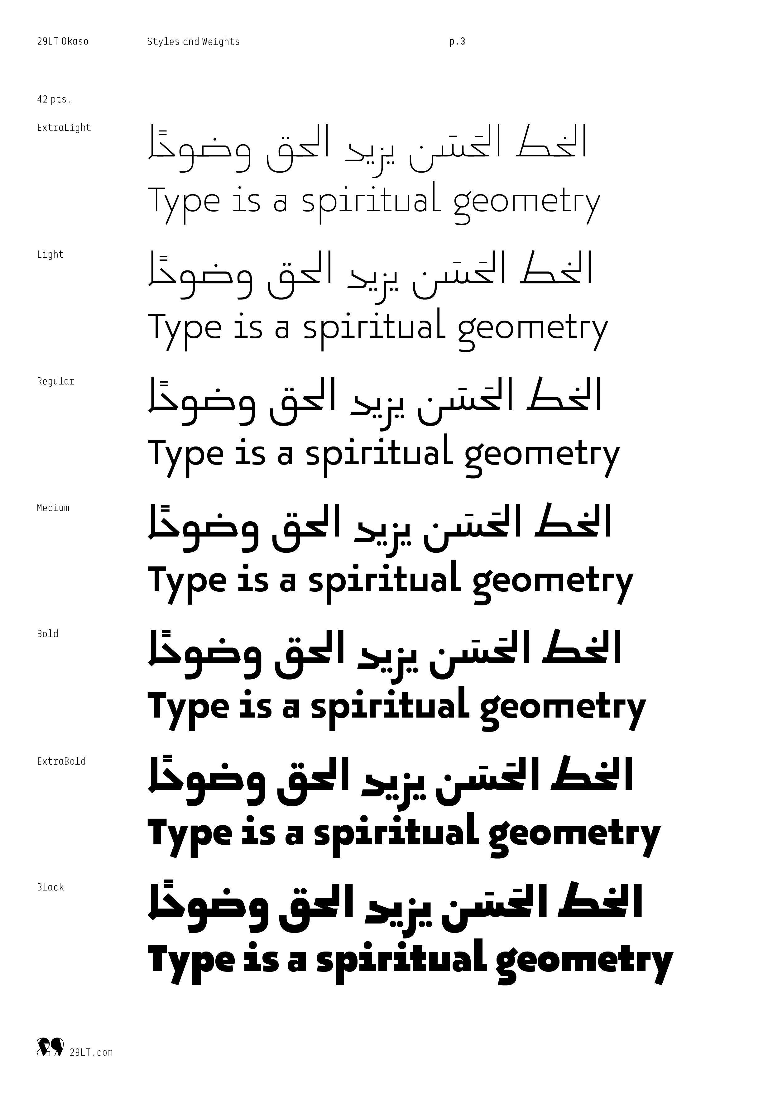
The typeface comes in seven weights (Extra Light, Light, Regular, Medium, Bold, Extra Bold, and Black) as well as in variable font format with two axes (Weight and Stretch).

As a Lebanese Arab living in Madrid since 2017, Pascal Zoghbi became interested in a vast number of Spanish historical and cultural topics, especially those that showcase the merging of both the Arabic and Spanish cultures. The Aljamiado topic represents one of many materials that grabbed his attention from the Arab, post-Arab, and Islamic eras in the Iberian Peninsula.

Brief Summary of the Aljamiado Topic
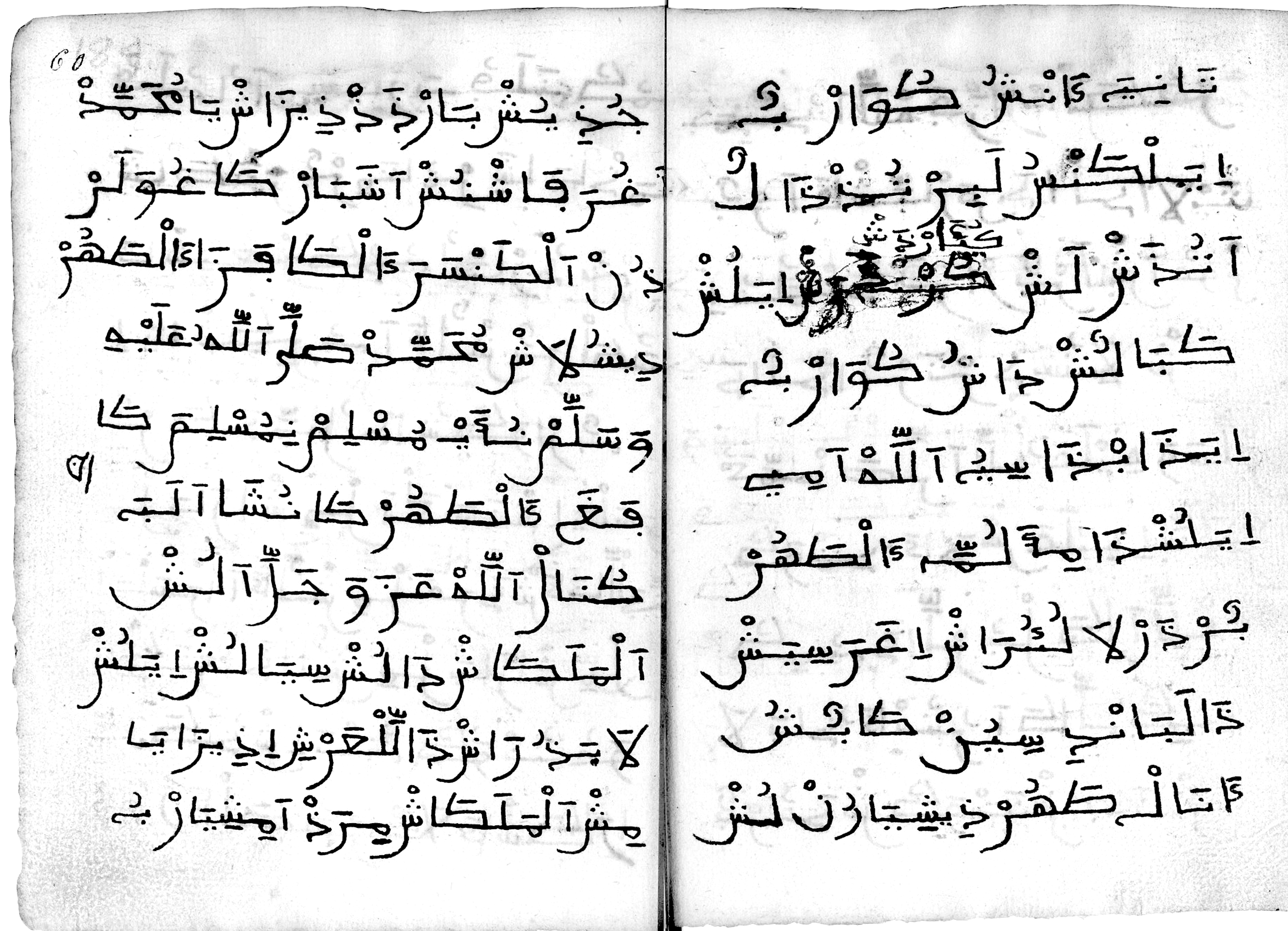
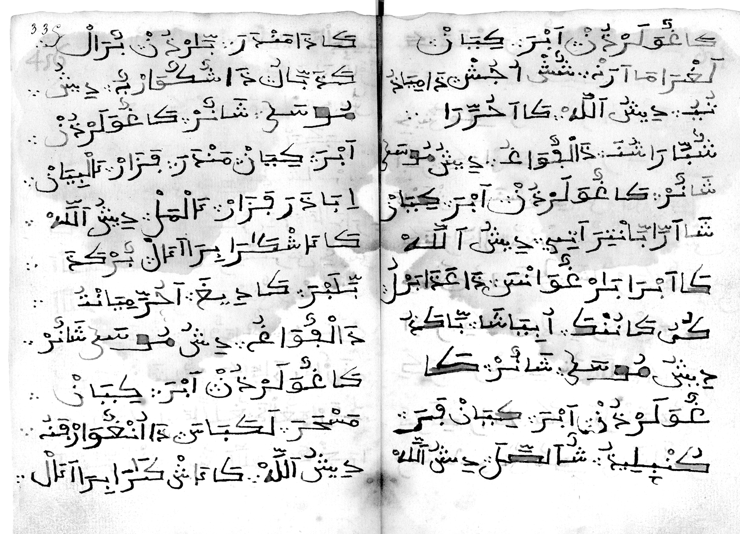
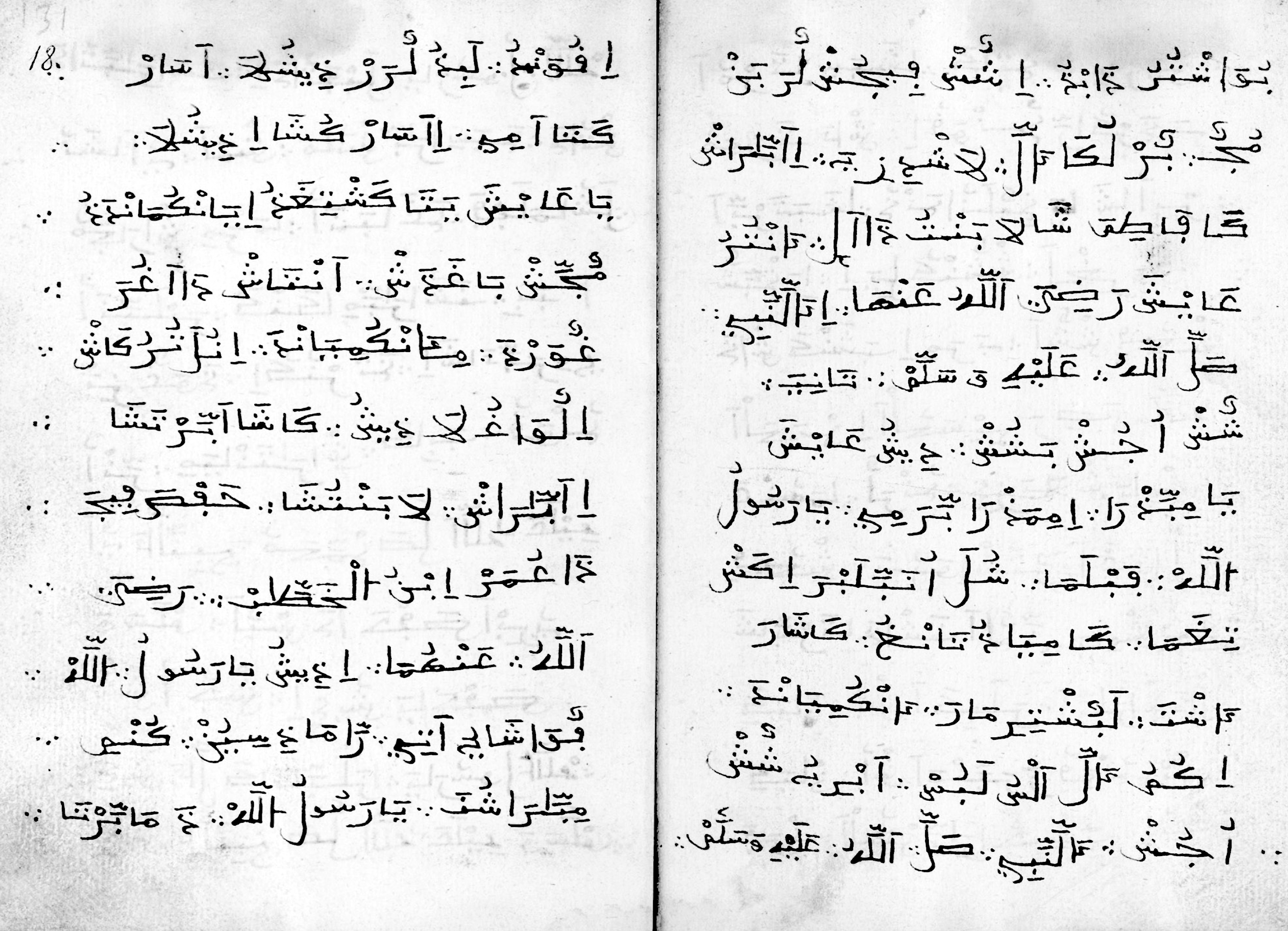
The image below is an extract from a manuscript written in the Aljamiado script. It is found in a bound compilation of writings containing the translation into a Romance language of the Islamic Fiqh book “Tanbīh Al-Ġāfilīn” by Naṣr ibn Muḥammad al-Samarqandī (died 983 A.D.), located in the Bibliothèque Nationale de France (BNF).

The text is written using the Arabic script, but when read out loud, it sounds like archaic Spanish filled with Arabic Islamic words (lexicons). This is what is called the Aljamiado script, coming from the Arabic word Al-‘Ajamiyya (العجمية in Arabic) meaning “non-Arabic language.” By definition, Aljamiado, or Aljamía texts, are manuscripts using the Arabic script for transcribing Romance languages such as Spanish and Portuguese. In linguistic terms, the Aljamía is the use of the Arabic alphabet adapted to transcribe the Romance Spanish in its evolution from Latin (or Neo-Latin language).

The two highlighted words «لَشْ لَغْرِمِشْ» read out phonetically from right to left are “lash lagrimash.” If the phonetic sounds are rearranged from left to right and subsequently changed to their equivalent Latin letters, the Spanish words “las lágrimas” appear. “Las lágrimas” means “the tears” in English and «الدموع» in Arabic. Hence, these exclusive manuscripts were only readable by individuals who know both the Arabic alphabet, with its slight adaptations, and the archaic Spanish language.
In brief, the existence of the Aljamiado writings started most probably by the end of the 13th century with the Mudéjars. The Mudéjars were the Muslims who remained in the Iberian Peninsula in the late medieval period, between the 13th and the end of the 15th centuries, after the start of the Christian conquests of the territories that once were al-Andalus, and who were allowed to keep and openly practice their Islamic religion. Their writings and translations were passed on to their descendants, the Moriscos, in the 16th century. They were obliged to convert to Christianity and were eventually expelled from Spain after the Catholic kingdoms reconquered all of the Iberian Peninsula and outlawed the clandestine practice of the Islamic religion between 1607 and 1609.

It is believed that most of the Mudéjars and later the Moriscos of the Iberian Peninsula were Muslims who practiced Islam but did not master the Arabic language. Theoretically, it was assumed that the loss of the Arabic language started to occur even before the reconquest of the Catholic kingdoms. This phenomenon accelerated with the domination of the Catholics and the succeeding intolerant attitude toward Islamic culture and heritage. The Arabic language was forgotten, and only a very few Moriscos could read and write in Arabic. Given that the Romance language was in use, they naturally needed to translate Islamic and jurisprudence writings to practice their religion. They were written in the Arabic script because the Arabic alphabet was considered sacred and fundamental in religious manuscripts.

Aljamiado can be compared to the Ottoman Turkish or Persian languages in the sense that they are non-Arabic languages written using the Arabic script after the adoption of the Islamic religion. What is surprising, though, is the fact that the Mudéjars did not develop and beautify the Arabic script as the Turks or the Persians did; on the contrary, they wrote the manuscripts in quick and rough handwriting, removing importance from mastered calligraphic writings. This happened possibly due to fact that the Iberian Peninsula was undergoing the shift from Islamic to Christian culture, while the reverse effect could be seen, for example, in the Ottoman Empire: A turn to an Islamic state where the use of the Arabic script was an important religious and governing aspect. Moreover, it might be possible that all master calligraphers left the peninsula with the fall of the Umayyad Caliphate of Cordoba and the end of the Taifas’ era, and the writing of the manuscripts was done by scholars and religious leaders who were not calligraphers themselves. Furthermore, the Aljamiado manuscripts were written and shared clandestinely during the Moriscos period. The manuscripts were used secretly and became a symbol of resistance against the Catholic rule, due to their link to the Islamic religion that was outlawed at the beginning of the 17th century, as mentioned before.
The Aljamiado topic is immense, and it is not possible to cover all aspects in this article. More in-depth studies can be found online and in libraries, especially in the Spanish language. Zoghbi was fortunate to meet Dr. Abboud-Haggar whose PhD was on the Aljamiado literature. She has written several books and articles about the topic, some of which are in the Bibliography, and she helped him gain a deeper insight into the historical situation in al-Andalus.

Research and Analysis of the Aljamiado Manuscripts
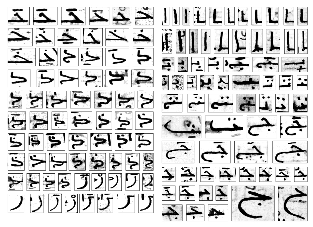
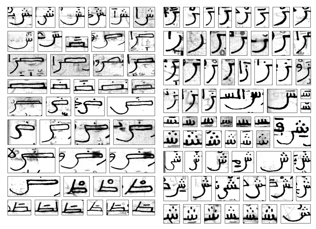
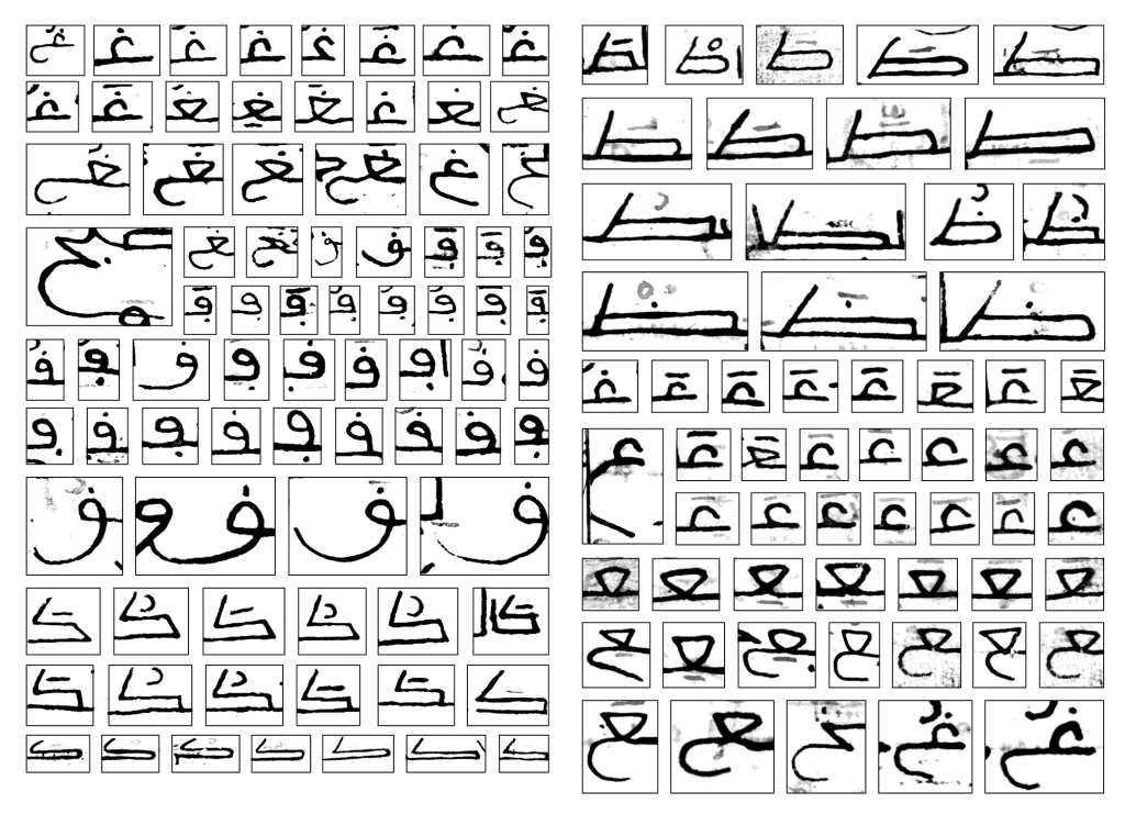
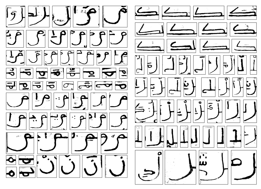
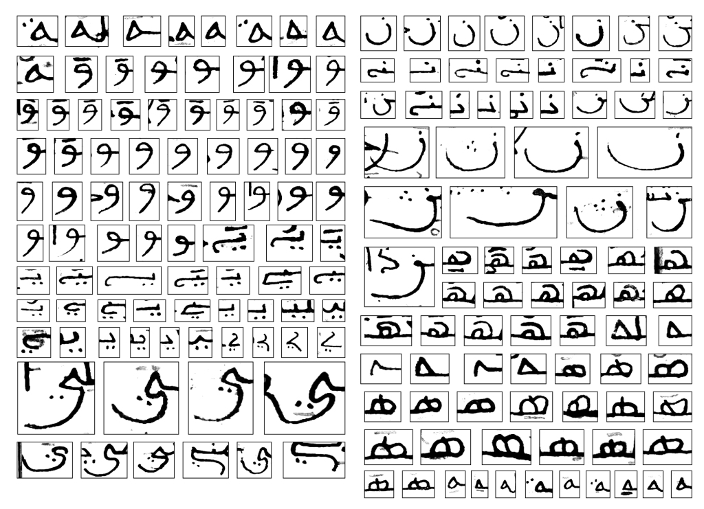
Researching the manuscripts, Zoghbi discovered different styles of handwriting. All of them stem from the Andalusian Maghribi Kufic style, but with different levels of simplification depending on the person writing them and the content of the text. Generally, it appeared that most of these manuscripts were written roughly by individuals who were not Arabic master calligraphers.

The manuscripts have a strange appeal that Zoghbi found interesting. They were the opposite of all the other elegant calligraphic manuscripts he had previously known. It was as if the essence of the Andalusian Maghribi style was present, but all the calligraphic splendor was extracted from it.
With the help of Adèle Gallé, Zoghbi extracted various examples of each letter and reinterpreted the letters into an unusual set of glyphs. Together they abstracted the vernacular letterforms into geometric and cursive glyphs. Two different directions were distilled from the research: A geometric set of glyphs was compiled to form the basis of 29LT Okaso typeface and a cursive set that created the basis of 29LT Oskura typeface.
Gallé, a Master’s student from La Cambre University in Brussels, interned at 29LT under the supervision of Pascal Zoghbi in the fall of 2019, in Madrid, Spain. During her internship, Zoghbi introduced her to the Aljamiado research topic, and they worked to analyze and decode the manuscripts.

They categorized different handwritten texts and selected a few to be studied in depth for the creation of the typefaces. They created a matrix to sort out all the different forms of each Arabic letter, followed by reordering the shapes from those most commonly found in the manuscript to the least common.
Based on the collected letterforms and understanding of the overall flow of the selected manuscript, Gallé and Zoghbi started sketching and drawing the basic Arabic character set. In order to maintain a harmonious design approach, and to ensure proportional letter structures, they undertook lengthy trials of drawing and swapping outlines.

Instead of producing an actual revival of the vernacular handwriting, the aim was to build a contemporary-looking Arabic set of glyphs abstracted from the letterforms found in the selected manuscript. Some letters were a direct inspiration from the manuscript, while others were drawn differently in order to achieve a harmonious texture in the typeface.
Different text flows resulted from different assembled character sets. Certain archaic Arabic letterforms could not be present in the default set, thus enabling legibility for modern readers. Hence, they drew alternating contours for the basic set, placing archaic forms in the stylistic set. This allows users to select the appropriate text flow that best fits the content.

Moving on from single letterforms to combined letter structures (ligatures) in the manuscripts, they reinterpreted within the typeface the ones occurring most often, while dropping the ones occurring the least, so as not to exhaust the endlessly growing character set. Zoghbi added extra ligatures to the fonts not found in the manuscript but that belonged to a list of standard ligatures incorporated in contemporary typefaces.


On the one hand, the geometric letterforms in Okaso result in being far off the end of the spectrum in comparison to the quick and rough handwritten manuscripts. On the other hand, Oskura tries to come closer in its cursive design approach. What is important for Zoghbi is the overall characteristics of the typeface and not the specific translation of each letter from the manuscript to the typeface.


The Arabic Type Design Concept
After Gallé’s two-month internship of research and basic drawings, Zoghbi continued working on the Arabic character set for another year. He accomplished a complete overhaul of the basic Arabic set and made keen design decisions strengthening the design concept of the typeface. It was clear from the start of the project that this Arabic typeface would be different in aesthetics and functionality from standard Arabic fonts in the market. The Aljamiado manuscripts are already different on their own, in comparison to other classical manuscripts composed of defined Arabic calligraphic styles. Due to the vernacular handwritten characteristic of the Aljamiado manuscripts, there is no specific calligraphic style present, but a rapid and simplified interpretation of the Andalusian Maghribi style. This simplification gave birth to original letterforms and ligatures absent from traditional Arabic calligraphy. That was one of the main aspects of the manuscripts that Zoghbi found bizarre, but exceptionally magical and mysterious upon second glance, and thus worth preserving in the digital typeface. A typeface with enigmatic typographic characteristics within a contemporary design setting.

Typographically speaking, the Arabic letters are low in contrast with short medial heights and long ascenders and descenders. A vibrant feel is present in the typeface due to the vertical shift of the baseline and the horizontal width change of the letters. The baseline shift is achieved by the addition of hundreds of ligatures, creating an active rhythm of text within a geometric typographic methodology. The horizontal width variation is present in the typeface due to the fact that some Arabic letters are wide (like the Sad, Dad, Tah, Zah, and Kaf), while the remaining are normal or narrow in width (like the Alef, Ha’, Ra’, Lam, Waw, etc.). This design aspect is boosted in the variable font format with the presence of the Stretch axes beside the Weight axes.


The Latin Type Design Concept
Beginning in 2020, during the process of developing the Arabic character set, Zoghbi contacted Linda Hintz, and they started to discuss the creation of a Latin character set to echo the experimental design approach of the Arabic set. Like Zoghbi, Hintz is a graduate of the TypeMedia Masters at The Royal Academy of Arts (KABK) in The Hague, The Netherlands, and worked at Monotype for some years before becoming an independent type designer.

After understanding the Aljamiado topic and being debriefed on the design characteristic of the Arabic set in development, Hintz embarked on a research of historical and modern Western typography that pushed the boundaries of Latin typography within a professional context. She researched diverse letter structures, drew and swapped different digital alternatives for each letter, and tested several Latin text flows alongside the Arabic. She found the process of designing the Latin character set like solving a riddle: A geometric design based on handwritten forms echoing the liveliness found in the Arabic script.


The solution was to emulate the vitality of the Arabic character set with a smart and active Latin set, by creating distinctive contextual alternates and stylistic sets that allow selected letters to switch between straight or round, and short or long forms. The interplay of square or round letterforms echoes the diverse straight and curved outlines existing in the Arabic glyphs. While the shift between short or long Latin letters reflects the horizontal width change existing naturally in Arabic letters, the Kashida notion is also taken into account. Kashida, Madda, or Tatweel is the elongation or extension of the baseline link between connecting Arabic letters used to set justified text. These ideas proved to be the ideal design solution and made both scripts come together without compromising either.


The Latin has short medial heights and long ascender and descender heights following the Arabic. In the quest for the Latin vertical heights to complement the multiple letter heights in the Arabic, Hintz drew the capital letters with heights halfway between the lowercases and the ascending heights, giving the typeface the contemporary feel they were looking for.

As in the Arabic set, the variable font enhances the usability of the elongation design feature with the presence of the Stretch axes. In both scripts, the selected letter or ligature that accepts elongation is significantly wider than the elongated letters found in the stylistic set of the static styles.

Naming the Typefaces of the Type System
The names of the typefaces within this type system will mark the first non-Arabic names in the 29LT catalog. Since the research topic is about the Aljamiado manuscripts and the existence of Muslims in medieval Spain, it was interesting to explore names stemming from the archaic Spanish language in use during the 15th century. The name Okaso comes from the Spanish word “ocaso” meaning twilight, sunset, or the end of an era or a phase. This name was adopted because the Aljamiado manuscript existed during the start of the fall of the Islamic Kingdom in the Iberian Peninsula. The letter “c” is replaced by the letter “k” since this how it was written in archaic Spanish. Furthermore, the letter “x” was used instead of the letter “s” during this era, but it was decided not to write the name as “Okaxo” since it will make it hard to pronounce for modern Spanish and international readers.

29LT Oskura, the second typeface, is the cursive version of Okaso. “Oscura”, “dark” in Spanish, was chosen as a name because it refers to the dark era of the end of the Muslims’ existence in the Iberian Peninsula. Moreover, the Aljamiado manuscripts were hidden in enclosed and dark spaces, like ceilings and double walls of houses. 29LT Oskura will exist as a typeface on its own and can act as 29LT Okaso’s upright italic.

An “Outline” and “Color” version of both Okaso and Oskura are planned as headline fonts that follow the handwritten convention of the titles found in the Aljamiado manuscripts. The idea emerged to name these headline typefaces with words meaning the opposite of “ocaso” and “oscura.” Unfortunately, these names already exist in the market. These Spanish words are “alba,” the opposite of “ocaso,” and “clara,” the contrary of “oscura.” Henceforward, suffixes will be added to the display typefaces, such as “Headline,” “Outline,” “Color,” or others.

29LT OkasoType Specimen
Visit 29LT Okaso webpage on www.29LT.com website and download the type specimen for full information about the typeface.
Bibliography
Abboud-Haggar, Soha, El tratado jurídico de al-Tafri’ de Ibn al-Gallab. Manuscrito aljamiado de Almonacid de la Sierra. Edición, estudio, glosario y confrontación con el original árabe, Institución Fernando el Católico, Zaragoza, 1999.
Abboud-Haggar, Soha,“Uddatu al-Hisni al-Hasin de Ibn al-Gazari al-dimašqi (traducido al aljamiado), una muestra de la transmisión de los asuntos religiosos islámicos de Oriente a Occidente,” Anaquel de Estudios Árabes, 16 (2005), 5–63.
Abboud-Haggar, Soha, Introducción a la dialectología de la lengua árabe, El Legado andalusí, Granada, 2010.
De Castilla, Nuria, Uses and Written Practices in Aljamiado Manuscripts, De Gruyter, Berlin, 2019.

