

Axure Tutorial: Basic Axure RP UI Environment Settings
Introduction
This article is a part of course Axure Full Course: Tutorial, Tips and Templates.
This tutorial covers the basic environment setup of the Axure RP interface. A description of all options for Customize the Main Toolbar is attached at the end of the article, which can be used as a reference.
The basic UI structure of Axure RP is as follows:
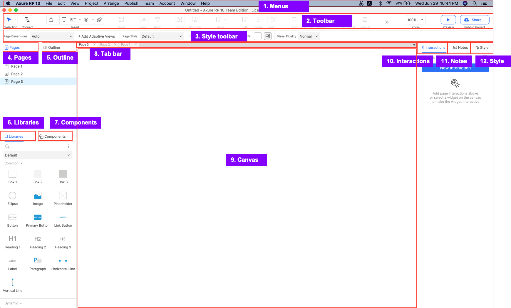
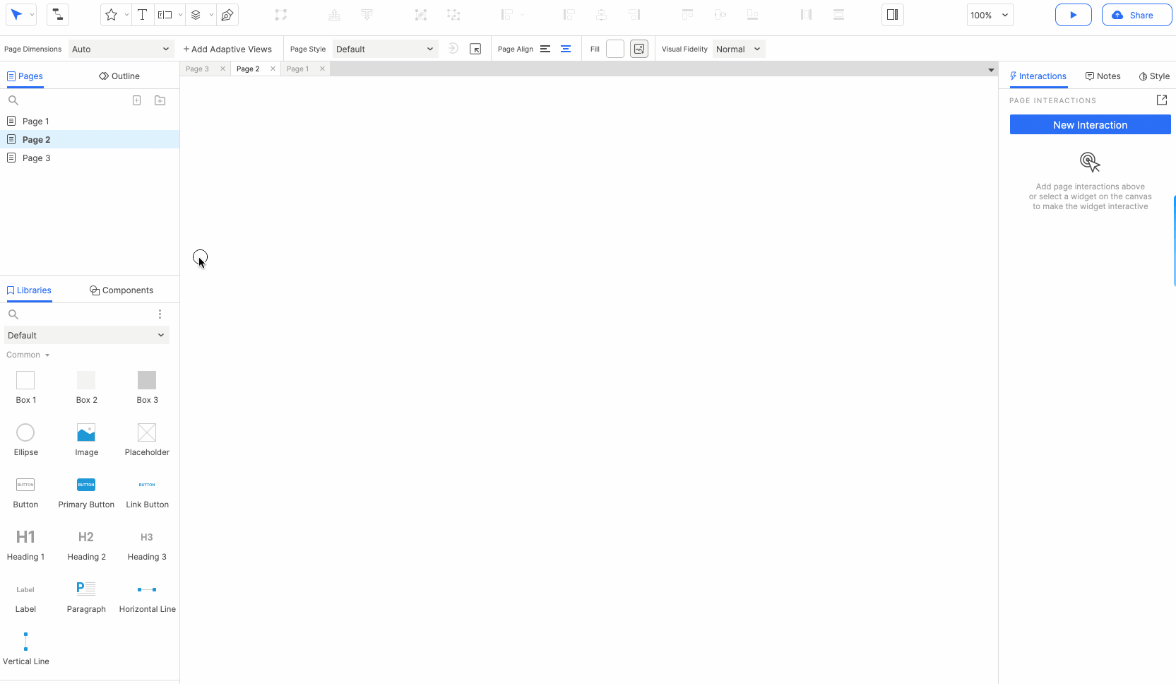
1. Menus
It contains almost all the important and commonly used actions in Axure. For example save, close the current project, set preferences for Axure etc.
2. Toolbar
Contains shortcut actions in Axure. These actions are mainly for widgets, such as aligning widgets, grouping/ungrouping widgets. Toolbar items can be customized, and we will describe it in detail later.
3. Style toolbar
Set the style of widgets or pages (options vary depending on the object you select).
4. Pages
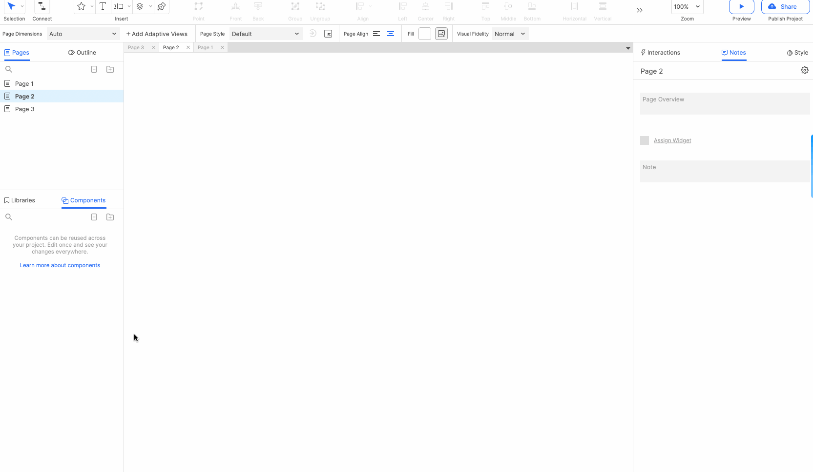
Pages pane is mainly used to add, delete, search and edit pages. The pages tab are fixed on the left side of the screen with Outline tab by default.
Customizing the Panes
Resizing the panes
Drag the left or right pane edge to resize the pane.
Pop up and merge panes into tabs
Drag the tab of the pane to pop up the pane and place it anywhere; you can also drag the pane to the pane tab bar and change its position.
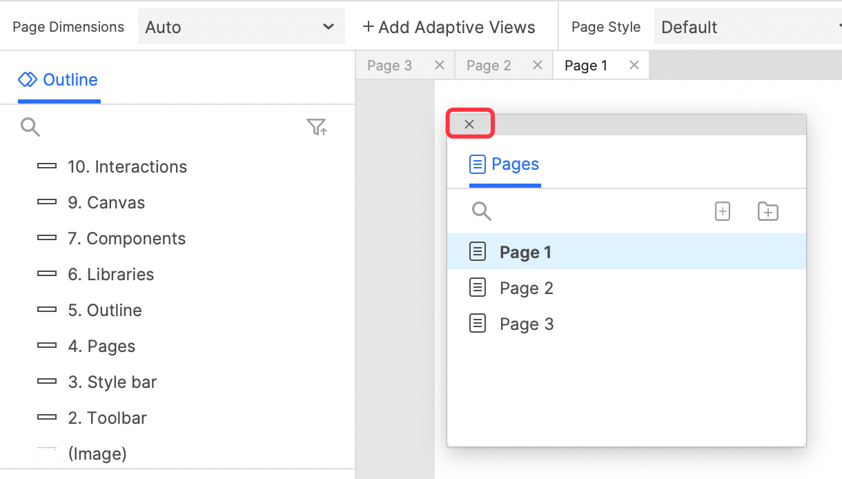
If you don't want a pane to be shown on the interface, pop up it and click the close button in the upper left corner.
Collapse and expand panes
Click the icon in the upper right corner of the pane tab bar to expand/collapse the pane.
Show and hide panes
Click View > Panes >Toggle Left Panes to toggle visibility of Left Panes.
Click View > Panes >Toggle Right Panes to toggle visibility of right Panes.
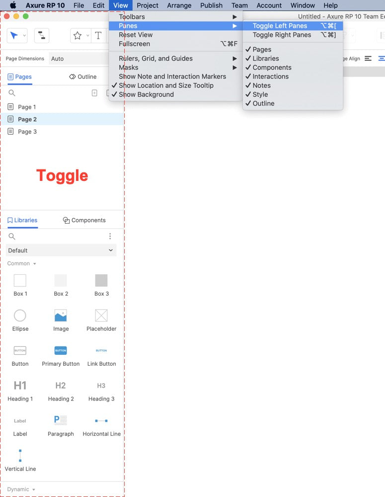
You can also click the button on the toolbar (you should customize toolbar to show them) to switch the visibility of the left or right panes.

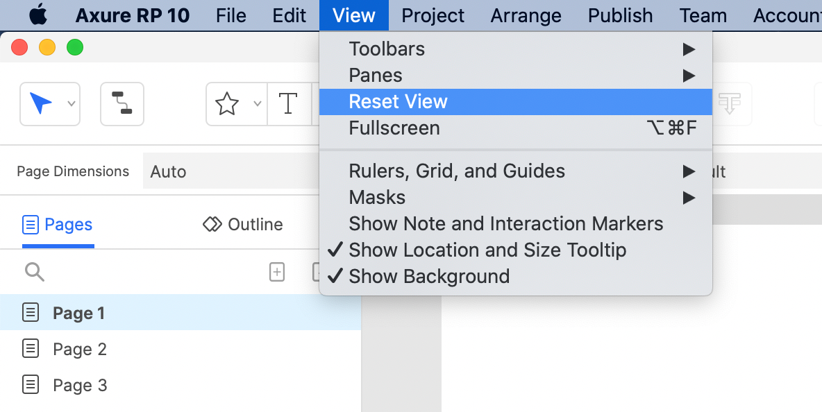
Reset View
A commonly used feature is Reset View. If you have adjusted the position or size of panes and want to restore the system settings, click View > Reset View in the menu bar.
Controls the full-screen or non-full-screen mode of the browser. In full-screen mode, the menu bar is not visible by default. Show the menu bar when the mouse is moved to the top of the screen, hide the menu bar when moved out
Customizing the Main Toolbar and Style Toolbar
Hide/Show the Main Toolbar
Click View > Toolbars > Main Toolbar to toggle the visibility of Main Toolbar.
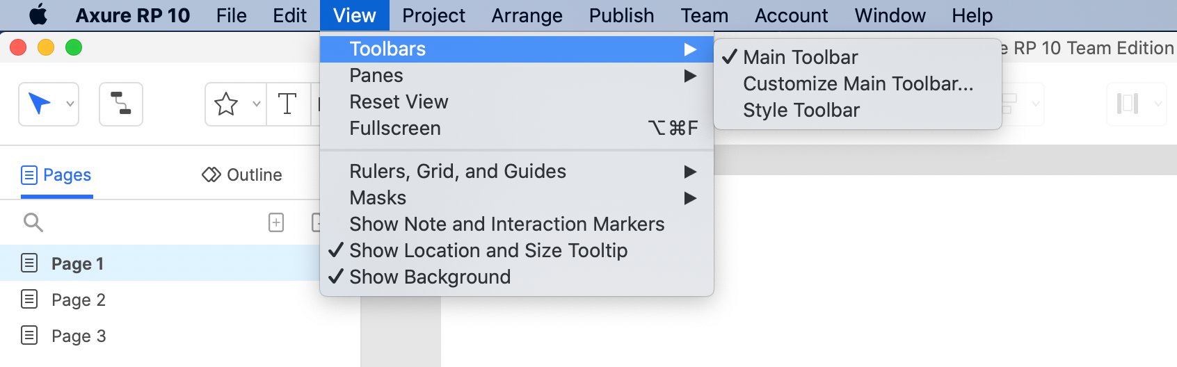
Click View > Toolbars > Customize Main Toolbar... to show pane of Customizing Toolbar.
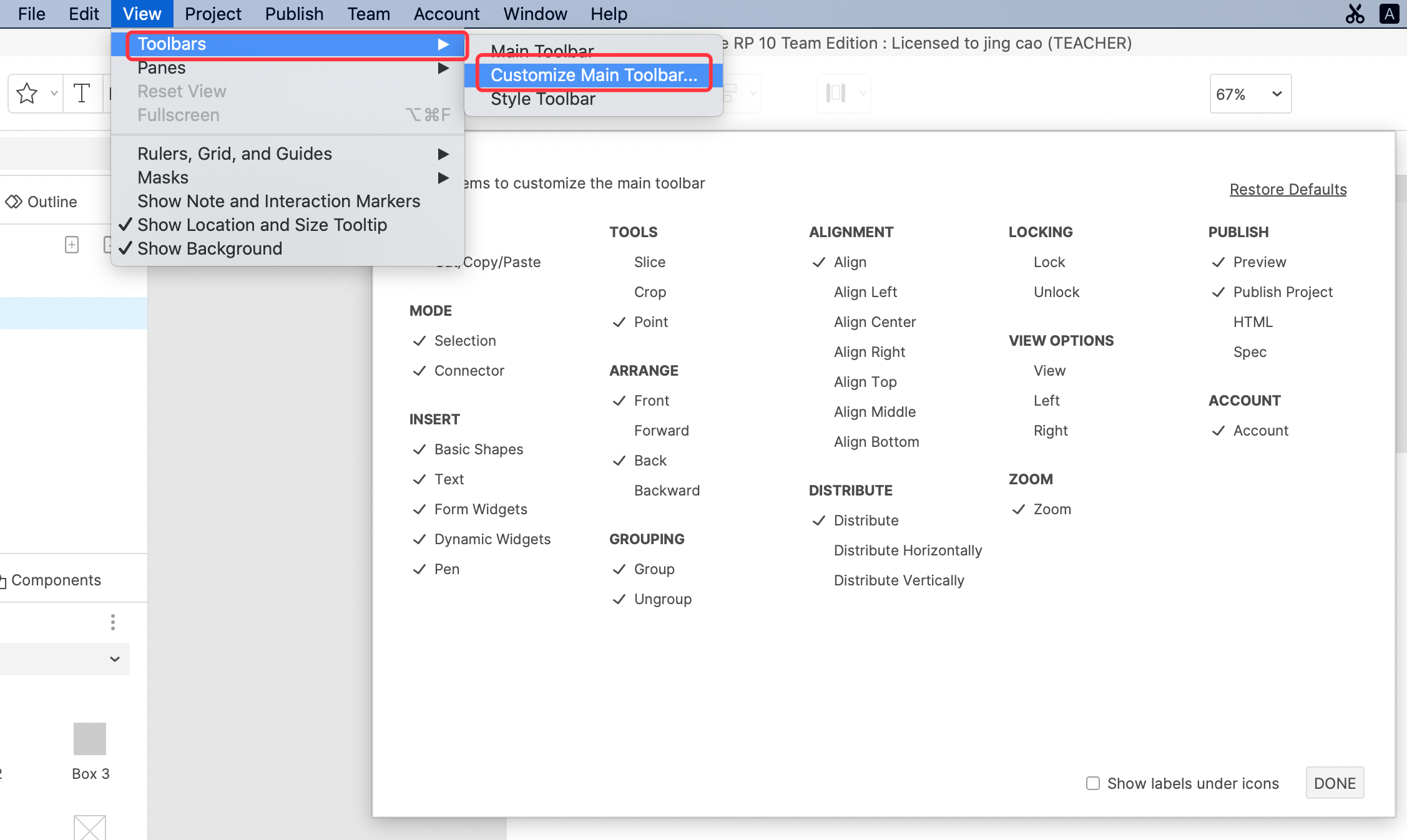
Check the feature buttons you want to shown on the Toolbar, you can also check whether to show the labels under the icons, click the Done button, the setting is complete.
Hide/Show the Main Toolbar
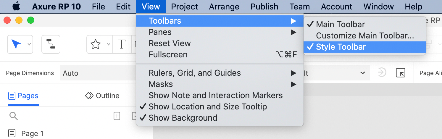
Click View > Toolbars > Style Toolbar to toggle the visibility of Style Toolbar.
Appendix: Introduction to all Main Toolbar Buttons
FILE:
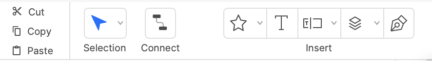
Cut/Copy/Paste
They are used to operate the elements (widgets, Components) in the Axure canvas. They are a very common tool, but they can usually be achieved with shortcut keys, so it is not recommended to show them.
MODE:
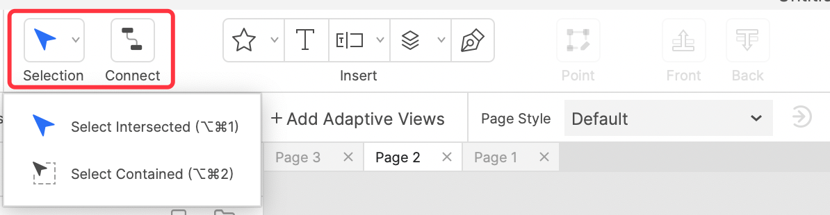
Selection: Used to select elements, there are 2 ways, one is within the mouse selection line, the other is the element that touches the mouse selection line is selected.
Connect: used to link different elements. It is often used to draw connection lines of flow charts.
Only one can be selected between Selection and Connect. It is recommended to show these two items, because we will often switch between these two modes.
INSERT
Basic Shapes: This tool is used to draw basic shapes.
Text: used to draw text.
Form Widgets: Contains commonly used form elements. Such as Text field, Text area, Drop list, List Box, Checkbox, Radio Button.
Dynamic Widgets: Includes Dynamic Panel, Repeater, Inline Frame, Hot Spot and Snapshot.
Pen: Used to draw custom graphics, similar to common UI design tools.

Among these, except for the pen tool, other widgets can be found in the default widget panel of the system, which is more convenient for dragging and dropping, so it is recommended to keep only the pen tool shown.
Slice: for slice image.
Crop: for crop image.
Point: used to edit the widget anchor point.
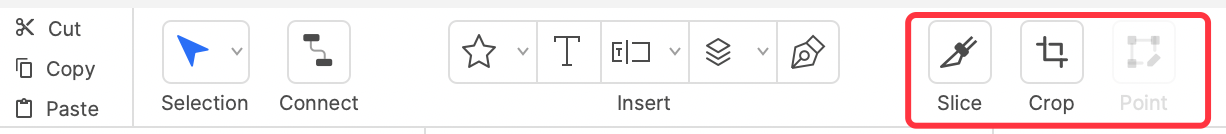
The features of Slice and Crop can be realized by right-clicking on the image, so these two items in the toolbar are not commonly used, and it is recommended not to show them; and the anchor editing feature is more commonly used, because it is not convenient to select by right-clicking, so it is recommended to keep it.
ARRANGE
Front: Bring the selected element to the front, commonly used feature.
Back: Put the selected element to the bottom, commonly used feature.
Forward: Move the selected element up one layer.
Backward: Move the selected element down one layer.

It is recommended to show Front and Back, but it is not recommended to show Forward and Backward, because there are too many element layers in Axure, and it is difficult to move up or down one layer to solve the problem at one time.
GROUPING
Group: Group the selected elements, commonly used feature.
Ungroup: Ungroup the selected elements, a common feature.

Both features are recommended to be retained. Because some people don't use shortcut keys frequently, or there are conflicting shortcut keys. They are a very frequently used features, and it is recommended to keep them.
Align: A drop-down list of aligned elements, which includes (Align) Left, Right, Center, Top, Middle, Button options;
Left: Align left;
Right: Align right;
Center: Align center;
Top: Align top;
Middle: Align middle;
Bottom: Align bottom.

Since the Align item includes all the following options, you can keep it only; but the other options are frequently used options, you can also keep them.
DISTRIBUTE
Distribute: Contains two options: Distribute Horizontally and Distribute Vertically;
Distribute Horizontally: Distribute the selected elements (at least 3 elements) horizontally;
Distribute Vertically: Distribute the selected elements (at least 3 elements) vertically.

Since the Distribute item includes all the following options, you can keep it only; but the other options are frequently used options, you can also keep them.
LOCKING
Lock: Lock the element(s), the locked element will not be able to change size and position, but can be deleted.
Unlock: Unlock the element(s).
Both of these features are not often used and can be hidden.
VIEW OPTIONS
View: Contains two options: (Toggle) Left and (Toggle) Right;
Left: Toggles the visibility of the left pane;
Right: Toggles the visibility of the right pane.

Both of these features are not often used and can be hidden.
Zoom: Contains options for zooming in and out of the canvas view: Zoom In, Zoom Out, Fit Selection, Fit All, and other sizes.

Commonly used features, it is recommended to keep.
PUBLISH
Preview: Preview the prototype generated by the current project, frequently used feature, it is recommended to keep.
Publish: Publish the prototype generated by the current project. Can choose Local or Axure Cloud.
Commonly used features, it is recommended to keep.
That is the content of this tutorial. If you have any questions and suggestions, please leave a message.
If you like the article, please share it with others with page link, thanks for your supporting!
Well Joe @AxureBoutique, a technology writer and teacher, focuses on Axure prototype design and product design.


Leave a comment